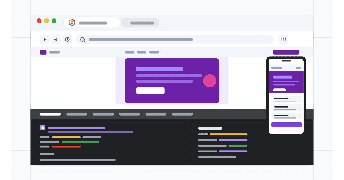
How to See Mobile View in Chrome: 5 Methods Compared (2026)
Switch to mobile view in Chrome 5 ways: DevTools device mode, keyboard shortcut, extensions, remote debugging, and dedicated testing tools.

Tips, tutorials, and insights on responsive design, cross-device testing, and web development.
Switch to mobile view in Chrome 5 ways: DevTools device mode, keyboard shortcut, extensions, remote debugging, and dedicated testing tools.
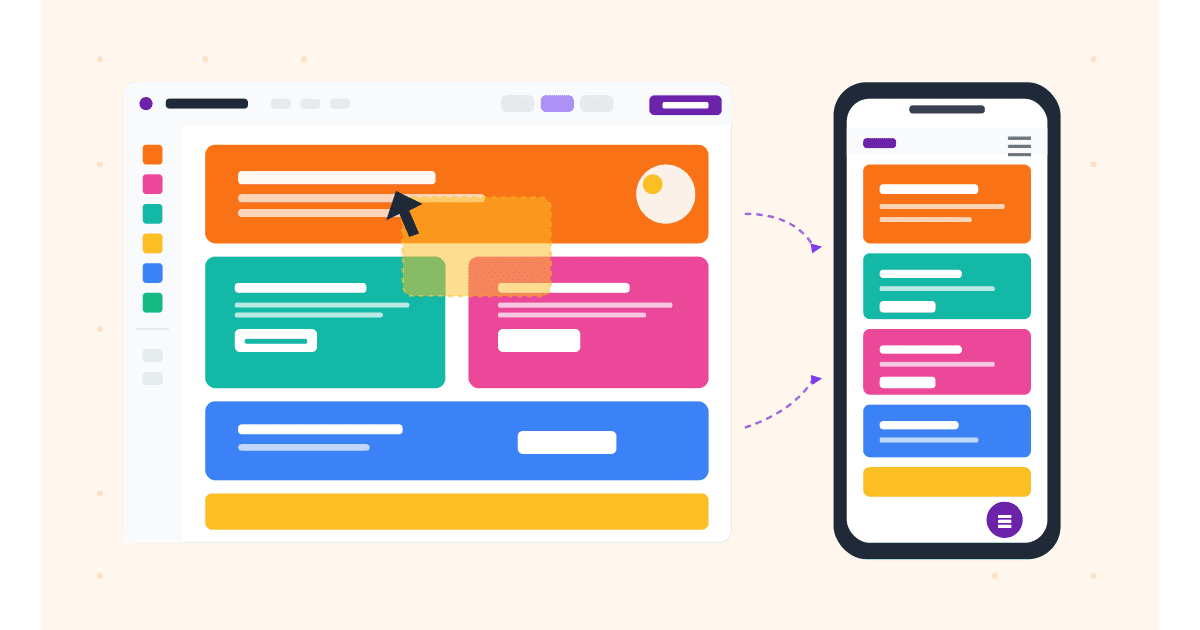
How to use the Wix Mobile Editor in 2026, including Wix Studio responsive breakpoints. Hide elements, customize menus, optimize for speed.
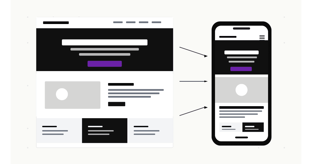
Complete guide to mobile view in Squarespace 7.1 and 7.0. Edit fonts, hide elements, customize the mobile menu, and test on real devices.

Preview your WordPress site on mobile with the Customizer, Gutenberg, Elementor, Divi, or external tools. Step-by-step screenshots for each.

5 free ways to view your website on mobile in 2026: browser tools, online checkers, real devices, simulators. Step-by-step with screenshots.
Personalized avatars are reshaping online identity in 2026. See why creators, gamers, streamers, and brands are switching from profile photos to custom animated characters across every platform.

Discover the eight best stock photo platforms for mobile creators in 2026, ranked by mobile usability, licensing clarity, content variety, and overall experience.

Find the best free mobile emulators for web development in 2026. Compare tools for testing responsive designs, mobile browsers, and device compatibility.


Compare Polypane, Sizzy, and MobileViewer for multi-device responsive testing. Find the best tool for your workflow and budget in 2026.