Chrome is the most-used browser on the planet, and it ships with one of the best mobile preview tools any browser offers. The catch is that most people know about one method (DevTools Device Mode) and miss the other four, which are faster, more accurate, or both for different jobs.
This guide compares all 5 ways to see mobile view in Chrome in 2026, when to use each, and the workflow that combines them. By the end, you will know exactly which Chrome method to reach for whether you are debugging a CSS bug, testing a layout across 10 devices, or verifying real iPhone-specific behavior.
Here is what you will learn:
- The 5 ways to see mobile view in Chrome, ranked by speed and accuracy
- How to customize the device list and add foldables, tablets, and ultra-wide phones
- How to throttle network and CPU to simulate slow connections
- Where Chrome's mobile emulation falls short and what to use instead
Skip the setup. Try MobileViewer.io free.
20 free tests, no signup required. Test on 50+ real device frames in one click.
Try MobileViewer.io free →Quick answer: the fastest way to see mobile view in Chrome
If you are in a hurry: press F12 to open DevTools, then Cmd-Shift-M (Mac) or Ctrl-Shift-M (Windows) to toggle Device Mode. Pick a device from the dropdown. That is the 3-second answer.
The rest of this guide covers the 4 other methods, when each is more useful, and how to combine them for a complete mobile testing workflow.
Method 1: Chrome DevTools Device Mode (the workhorse)
DevTools Device Mode is what 90% of developers use 90% of the time. It is built into every copy of Chrome and works on any page you can open.
Steps:
- Press F12 or right-click the page and choose Inspect.
- Click the device toolbar icon at the top-left of DevTools (the small phone/tablet icon).
- Pick a device from the dropdown at the top of the page: iPhone 15 Pro, Pixel 8, iPad Air, Galaxy S20 Ultra, and many more.
- Use the rotate icon to switch between portrait and landscape.
- Adjust the device pixel ratio (DPR) if needed (defaults to the real device's DPR).
What Device Mode actually does:
- Resizes the viewport to the device's CSS pixel dimensions.
- Sets the User-Agent string to match the device.
- Emulates touch events (when in Mobile mode).
- Adjusts the device pixel ratio for HiDPI rendering.
What it does not do:
- Run the iOS Safari rendering engine (it runs Chrome's Blink, even when emulating iPhone).
- Reproduce iOS-only bugs (100vh, certain font rendering, scroll behaviors).
- Simulate real hardware performance limits.
This is the most important nuance: emulating an iPhone in Chrome is not testing on an iPhone. For day-to-day responsive checks, Device Mode is fine. For iOS-specific bugs, you need real Safari or Safari Responsive Design Mode.
Method 2: Keyboard shortcuts to toggle responsive mode
DevTools is fast, but it is faster when you skip the mouse.
Essential shortcuts:
- Open DevTools: F12 (Windows/Linux) or Cmd-Opt-I (Mac).
- Toggle Device Mode: Cmd-Shift-M (Mac) or Ctrl-Shift-M (Windows/Linux), while DevTools is open.
- Open Command Menu: Cmd-Shift-P (Mac) or Ctrl-Shift-P (Windows/Linux). Type "device" to get device-related commands instantly.
- Capture screenshot: Cmd-Shift-P > "Capture screenshot." Saves the current viewport as PNG.
- Capture full size screenshot: Cmd-Shift-P > "Capture full size screenshot." Captures the entire page, not just the visible portion.
Power-user shortcuts inside Device Mode:
- Press Shift + arrow keys to resize the viewport in 10-pixel increments.
- Click the resize handle on the right edge and drag to set a custom width.
- Press R while focused on the viewport to rotate orientation.
Learning these saves 30 minutes a day if you do mobile QA regularly. They turn DevTools from a heavy tool into an extension of your hands.
Method 3: Chrome extensions for responsive testing
Sometimes you want a quick mobile check without opening DevTools. Extensions cover this case.
Top picks in 2026:
Responsive Viewer (Chrome Web Store):
Shows your page on multiple device frames at once, in a single browser tab. Pick 4-6 devices and see them side by side. Useful for design reviews and quick layout sweeps.
Mobile View Switcher:
Toggles a mobile User-Agent and viewport with a single click. Faster than opening DevTools when you just need to confirm a mobile-only redirect or check a User-Agent-conditional render.
Window Resizer:
Quickly resizes the entire browser window (not just the page area) to common breakpoints: 320, 375, 414, 768, 1024. Useful when you want to see the actual Chrome chrome at a mobile size.
User-Agent Switcher and Manager:
Changes the User-Agent string for any tab. Useful for testing user-agent-conditional logic without DevTools.
Pros of extensions:
- One-click access.
- Some (like Responsive Viewer) show multiple devices simultaneously.
- Free.
Cons:
- Most only resize the viewport without emulating touch, DPR, or other device properties.
- Multi-device extensions can be heavy in memory.
- Quality varies. Stick to extensions with 100,000+ users and recent updates.
For more options, see our roundup of 8 best free Chrome extensions for responsive testing in 2026.
Method 4: Remote debugging a real Android device via Chrome
This is the most accurate Chrome method: connect a real Android phone to your computer and inspect your site running in real Chrome on the device.
Setup steps (one-time):
- On your Android phone, go to Settings > About phone > tap "Build number" 7 times to enable Developer Options.
- In Developer Options, enable "USB debugging."
- Connect the phone to your computer via USB cable.
- Trust the computer when prompted on the phone.
To inspect:
- On the phone, open Chrome and navigate to your site.
- On your desktop Chrome, type chrome://inspect in the address bar.
- You should see your device listed.
- Click "Inspect" next to the open tab.
- A DevTools window opens, showing the live DOM and JavaScript console of the page on your phone.
What this lets you do:
- See the actual rendering on real Android Chrome hardware.
- Inspect elements and edit CSS live (changes reflect on the phone immediately).
- Debug JavaScript with breakpoints, all running on the real device.
- Test touch events with your real finger while DevTools shows the event data.
Use cases:
- Reproducing Android-specific bugs that emulation misses.
- Testing performance on real hardware (not your laptop's CPU).
- Verifying scroll behavior, touch gestures, and viewport handling.
This is the gold standard for Android testing. The setup takes 10 minutes the first time; after that it is a 30-second routine.
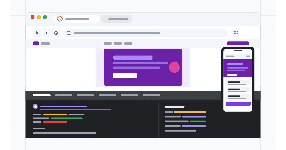
Method 5: Dedicated tools (MobileViewer.io and others)
DevTools is built into Chrome and is great. But when you need to see your site on iPhone, iPad, Android, and foldables all at once, DevTools is not the right tool. You need a dedicated multi-device preview.
- Paste any URL.
- Choose from 50+ device frames including current iPhones, Galaxy S models, Pixels, iPads, foldables.
- See multiple frames side by side.
- Geographic emulation for testing localized sites.
- Free tier covers 20 tests; 200 free with signup.
BrowserStack Responsive:
- Free tier at browserstack.com/responsive.
- Real device cloud for paid plans.
- Strong for cross-browser testing beyond Chrome.
LambdaTest LT Browser:
- Free desktop app.
- 50+ device frames.
- Built-in screenshot and recording tools.
For most teams, MobileViewer.io covers the daily multi-device sweep. BrowserStack and LambdaTest add real-device cloud for pre-launch verification. Compare them in our browserstack vs lambdatest vs mobileviewer breakdown.
Running Lighthouse mobile audits in Chrome DevTools
Lighthouse is the same audit engine behind PageSpeed Insights, built into Chrome DevTools. It provides a comprehensive mobile audit in 30 seconds.
Steps:
- Open the page in Chrome.
- Press F12 to open DevTools.
- Click the Lighthouse tab (sometimes called "Audits" in older Chrome versions).
- Check Mobile as the device.
- Check the categories you want: Performance, Accessibility, Best Practices, SEO, Progressive Web App.
- Click Analyze page load.
What you get:
- A score (0-100) in each category.
- A filmstrip showing how the page loads on a simulated mobile device.
- Specific issues with code-level recommendations.
- A downloadable HTML or JSON report.
Interpreting Lighthouse mobile scores:
- 90-100: Good. Few or no issues.
- 50-89: Needs improvement. Address top 3 issues.
- 0-49: Poor. Significant problems.
Lighthouse uses lab data (controlled environment) rather than real-user data. For real-user metrics, use PageSpeed Insights (which combines Lighthouse with Chrome User Experience Report data) or Search Console.
Common mobile Lighthouse issues:
- Render-blocking resources (CSS or JS in the head that delays first paint).
- Large network payloads (over 1.5 MB on mobile).
- Unused JavaScript or CSS.
- Improperly sized images (serving desktop-size images to mobile).
- No text compression (Brotli or Gzip).
Each issue comes with a specific fix. Lighthouse pays for itself in two reports.
Debugging mobile JavaScript performance
Mobile devices have slower CPUs than laptops. JavaScript that runs in 50 ms on your MacBook can take 300 ms on a Pixel 6a. Chrome's Performance panel exposes this.
Steps:
- Open DevTools, click the Performance tab.
- In the gear icon, set CPU throttling to 4x slowdown (mid-range Android) or 6x slowdown (low-end Android).
- Set Network to Slow 4G.
- Click the record icon, reload the page, wait 5 seconds, stop recording.
- The flame chart shows every JavaScript function, every CSS calculation, every layout.
What to look for:
- Long Tasks (over 50 ms): any script blocking the main thread for more than 50 ms hurts INP (Interaction to Next Paint).
- Forced reflows: JavaScript that reads layout properties and then writes to the DOM triggers expensive reflows.
- Excessive style recalculations: changes to many DOM elements at once can cause layout thrashing.
- Render-blocking scripts: scripts in the head with no
asyncordefer.
Common fixes:
- Move third-party scripts (analytics, chat widgets) to load after
DOMContentLoaded. - Defer non-critical CSS using
media="print" onload="this.media='all'". - Break up long JavaScript tasks with
requestIdleCallbackorsetTimeout. - Reduce JavaScript bundle size with code splitting.
The Performance panel is dense but worth learning. A single recording can reveal why your mobile INP score is in the red.
Testing PWAs and offline behavior in Chrome
Progressive Web Apps (PWAs) need mobile-specific verification beyond the regular page. Chrome DevTools includes tools for this.
Application panel:
- Open DevTools.
- Click the Application tab.
- The left sidebar shows: Manifest, Service Workers, Storage, Cache.
Manifest:
Click Manifest to see your manifest.json parsed. Verify that the icons (192x192 and 512x512 minimums) are present and load. The Manifest panel also previews what the install dialog will show.
Service Workers:
Click Service Workers to see the current registration status. You can:
- Update the service worker manually to test new versions.
- Toggle Offline mode to simulate no network. The site should still load if the service worker caches the right assets.
- Unregister and reload to test the first-visit experience.
Offline simulation:
In the Network tab, choose "Offline" from the throttling dropdown. Reload the page. A well-built PWA serves cached assets and shows an offline-aware UI. A non-PWA shows the browser's offline error page.
Lighthouse PWA audit:
The Lighthouse PWA category checks for service worker registration, manifest validity, HTTPS, fast load, and proper icons. A score of 100 means your site qualifies as an installable PWA.
For deeper PWA testing on real iOS Safari, use Xcode Simulator or a real iPhone. Chrome's PWA tools cover Android well; iOS PWA verification needs Safari.
How to customize the device list in Chrome DevTools
The default device list is good but not exhaustive. You can add custom devices.
Steps:
- Open DevTools (F12).
- Click the three-dot menu at the top of DevTools.
- Choose Settings (or press F1).
- Click "Devices" in the left sidebar.
- Click "Add custom device."
- Fill in: name, width, height, device pixel ratio, user agent string.
Useful custom devices to add:
- iPhone 16 Pro Max: width 440, height 956, DPR 3, UA string from Apple's developer site.
- Galaxy Z Fold 5 (unfolded): width 768, height 952, DPR 2.6.
- iPad Pro 12.9 (M4): width 1024, height 1366, DPR 2.
- Pixel Fold: width 673, height 841, DPR 2.5.
The DPR matters for image testing. Setting it correctly shows you whether your srcset is serving the right resolution.
Throttling network and CPU to simulate slow connections
Mobile users are rarely on fast Wi-Fi. To realistically test mobile performance, throttle the connection.
Network throttling:
- Open DevTools.
- Go to the Network tab.
- In the throttling dropdown (usually shows "No throttling"), choose "Slow 4G" or "Fast 4G."
- Reload the page.
Slow 4G simulates a typical mobile connection: 400 ms latency, 400 Kbps download. Fast 4G is closer to LTE: 170 ms latency, 4 Mbps. Most real mobile users sit between these two.
CPU throttling:
- Open DevTools.
- Go to the Performance tab.
- In the gear icon settings, set CPU to "4x slowdown" or "6x slowdown."
- Reload the page.
CPU throttling simulates lower-end mobile hardware. A 6x slowdown on a modern MacBook approximates a low-end Android phone. This catches performance bugs that only appear under processing pressure (slow JavaScript, expensive CSS).
Combined test:
Set network to Slow 4G AND CPU to 6x slowdown, then reload. If the page is still usable, you have a genuinely fast mobile experience. If it falls apart, the page is over-engineered for mobile.
Simulating touch events in Chrome
By default, Device Mode emulates touch events. You can verify and configure this.
To check:
- With Device Mode on, open the three-dot menu in the device toolbar.
- Verify "Show device frame" and "Touch" are set as you expect.
To force touch events:
- Open the Sensors panel (Cmd-Shift-P > "Show Sensors").
- Under "Touch," choose "Force enabled."
To debug touch event listeners:
Use the JavaScript console. Click an element with a touch listener, then in the console, run:
getEventListeners(document.querySelector('.my-button'))This shows all event listeners attached, including touch events.
Touch emulation in Chrome is faithful, but it cannot reproduce real touch gestures (pinch-to-zoom, edge-swipe). For those, use a real Android device via remote debugging.
Capturing mobile screenshots in Chrome
Sometimes you need a clean mobile screenshot, not a screen recording of your laptop screen.
Three options:
1. Visible viewport screenshot:
Cmd-Shift-P > "Capture screenshot." Saves the current visible area as PNG.
2. Full-page screenshot:
Cmd-Shift-P > "Capture full size screenshot." Saves the entire scrolled page, even content below the fold.
3. Node screenshot:
In the Elements panel, right-click any DOM node and choose "Capture node screenshot." Saves just that element as PNG.
The full-size screenshot is the most useful for design reviews. You see the entire mobile page in one image, which makes it easy to share for feedback or to compare with the design mockup.
Where Chrome's mobile emulation falls short
Knowing the limits is more useful than ignoring them.
iOS Safari engine: Chrome runs Blink, not WebKit. Bugs that only appear on iOS Safari (100vh, certain font rendering, scroll-snap behavior) will not show up in Chrome's iPhone emulation.
Touch gestures: Emulated touch events work for tap, swipe, and basic pinch. Real iOS gestures like edge-swipe-back and three-finger swipe cannot be reproduced.
Real hardware performance: Chrome's CPU throttling approximates slow devices but does not match the actual thermal behavior, GPU performance, or memory limits of a budget Android phone.
iOS-only features: Apple Pay, Sign in with Apple, Safari Reader Mode, iOS share sheet integration. All of these need real iOS to test.
Cellular network features: Chrome cannot simulate cellular handoff (Wi-Fi to 4G), spotty connections, or zero-rated zero data scenarios.
The fix:
Combine Chrome DevTools (for daily work) with MobileViewer.io (for multi-device sweep) and a real iPhone (for iOS-specific verification). Each one covers a gap the others leave.
When to use Chrome DevTools vs a real device vs a dedicated tool
A decision matrix to keep on your wall.
| Task | Best tool |
|---|---|
| Writing CSS for a new component | Chrome DevTools Device Mode |
| Multi-device responsive sweep | MobileViewer.io |
| Final iOS verification | Real iPhone with Safari |
| Real Android Chrome testing | Real Android with chrome://inspect |
| Reproducing a specific iOS bug | Real iPhone (no substitute) |
| Quick visual check at 5 sizes | Chrome extension (Responsive Viewer) |
| Performance audit | Chrome DevTools + Lighthouse |
The right answer for "how do I check mobile" depends on what you are checking and how thorough you need to be.
Test on 50+ real devices in one click.
Get 200 free tests when you sign up. Compare layouts side-by-side across iPhones, iPads, Pixels, and more.
Start testing on MobileViewer.io →Conclusion
Chrome ships one of the most powerful mobile preview toolkits any browser has. DevTools Device Mode handles 90% of daily work. Remote debugging unlocks real-device accuracy for Android. Extensions add multi-device convenience. Dedicated tools fill the gaps Chrome cannot.
The workflow that works: use DevTools while coding, use a multi-device tool like MobileViewer.io before publishing, verify on real devices for final QA. Stop assuming Chrome's iPhone emulation tells you the truth about iPhone. Use it for layout, use Safari for iOS verification. That separation will save you from 90% of the iOS bugs that get shipped to production.
Frequently asked questions
How do I switch to mobile view in Chrome?
Press F12 to open DevTools, then Cmd-Shift-M (Mac) or Ctrl-Shift-M (Windows) to toggle Device Mode. Pick a device from the dropdown at the top of the page. The viewport resizes and Chrome emulates the device's User-Agent and touch input.
What's the keyboard shortcut for mobile view in Chrome?
Cmd-Shift-M on Mac, Ctrl-Shift-M on Windows or Linux. This toggles Device Mode while DevTools is already open. Combined with F12 (open DevTools), you can switch to mobile view in under a second.
Is Chrome DevTools mobile view accurate for iPhone testing?
For layout and CSS, mostly yes. For iOS-specific bugs, no. Chrome runs Blink, not WebKit. iOS Safari quirks like 100vh, position:sticky inside overflow containers, and certain font rendering will not appear in Chrome's iPhone emulation. Use Safari Responsive Design Mode or a real iPhone for those.
Can I view my site on a real Android phone from Chrome?
Yes. Enable USB debugging on the Android phone, connect via USB, and open chrome://inspect in desktop Chrome. You will see the device listed; click Inspect next to the open tab to open a live DevTools session connected to the real device.
How do I add a custom device in Chrome DevTools?
Open DevTools, click the three-dot menu, choose Settings, click Devices, then "Add custom device." Fill in name, width, height, device pixel ratio, and User-Agent string. The device appears in the dropdown immediately.
Does Chrome simulate touch events in mobile view?
Yes. When Device Mode is active and the device is a phone or tablet, Chrome emulates touch events automatically. To force touch on any device, open the Sensors panel (Cmd-Shift-P > "Show Sensors") and set Touch to "Force enabled."
What's the difference between Chrome DevTools and BrowserStack?
Chrome DevTools emulates devices using Chrome's own rendering engine. BrowserStack provides real devices in a cloud, which run real iOS or Android with their actual browser engines. DevTools is faster and free; BrowserStack is more accurate but paid. Use DevTools for daily work and BrowserStack (or a free alternative like MobileViewer.io) for final cross-device verification.
Need to see your site on real device frames? Try MobileViewer.io free. Or compare with Safari Responsive Design Mode for iOS-specific testing.