If you ship a website that real iPhone users see, you should test it in real Safari. Not in Chrome's iPhone emulation. Real Safari. The two render the web in meaningfully different ways, and the bugs you ship to iOS users almost always come from the gap between them.
Safari Responsive Design Mode is the closest thing to testing on a real iPhone without owning one. It runs WebKit (the same engine iOS Safari uses), shows your site at iPhone and iPad viewport sizes, and lets you switch user agents to mimic different iOS versions. Combined with the Safari Web Inspector and its real-iPhone debugging, it is the single most underused tool on the average designer's Mac.
This guide walks through enabling Safari's Develop menu, using Responsive Design Mode, testing iOS-only quirks, and connecting a real iPhone for live inspection.
Here is what you will learn:
- How to enable Safari's Develop menu and Responsive Design Mode
- Which iOS-only bugs only show up in real Safari and how to spot them
- How to inspect a real iPhone from your Mac via the Safari Web Inspector
- The recommended workflow for testing iOS Safari in 2026
Skip the setup. Try MobileViewer.io free.
20 free tests, no signup required. Test on 50+ real device frames in one click.
Try MobileViewer.io free →Why testing in Safari matters more than people think
In 2026, iOS Safari accounts for roughly 25% of all mobile web traffic globally and closer to 60% in the US. Apple users skew toward higher income, which means iOS visitors disproportionately matter for e-commerce, SaaS conversion, and premium B2B.
Beyond market share, iOS Safari is technically distinct. It runs WebKit. Chrome runs Blink. Firefox runs Gecko. Each engine implements the web standards slightly differently, and the differences land on real users.
Bugs that only show up in iOS Safari:
- 100vh viewport unit:
height: 100vhdoes not match the actual visible area because Safari's address bar and home indicator overlap. Use100svh(small viewport height) or100dvh(dynamic). - position: sticky inside overflow containers: broken until Safari 17.
- Custom date and time pickers: iOS forces its own native picker for
input type="date", overriding custom JavaScript datepickers. - Web push notifications: only available on iOS 16.4 and up, and the registration flow differs from Chrome.
- IndexedDB quirks: iOS Safari has aggressive cache eviction that desktop browsers do not.
Chrome cannot reproduce these. If you only test in Chrome's iPhone emulation, you will ship these bugs to your iOS users.
Enabling the Develop menu in Safari
The Develop menu is hidden by default. Enable it once and it stays on.
Safari 17 and later (2024 onward):
- Open Safari.
- Click Safari in the menu bar, then Settings (or press Cmd-,).
- Click the Advanced tab.
- Check the box labeled "Show features for web developers."
- Close Settings.
The Develop menu now appears in your menu bar, between Bookmarks and Window.
Safari 16 and earlier:
Same path, but the checkbox is labeled "Show Develop menu in menu bar."
If the Develop menu still does not appear, restart Safari. On managed Macs, the Develop menu may be disabled by IT policy; ask your administrator to enable it.
Verifying the Develop menu works: click it. You should see options including Web Inspector, Responsive Design Mode, User Agent, and Show Page Source. If those are missing, the menu is not fully enabled.
Opening Responsive Design Mode
Once the Develop menu is on, Responsive Design Mode is one click away.
Steps:
- Open the page you want to test in Safari.
- In the menu bar, click Develop.
- Choose Enter Responsive Design Mode (or press Cmd-Opt-R).
The window switches to a multi-device preview. At the top, you will see:
- Device buttons: quick-select for common iPhones, iPads, and other Apple devices.
- A user agent selector: to test different browsers (Safari iOS, Safari Mac, Chrome, etc.).
- A custom width input: to set any pixel width.
- An orientation toggle: portrait or landscape.
The preview area renders your page at the chosen viewport. You can interact with the page normally (click, scroll, fill forms). Touch events are simulated for click events but not for real gestures.
To exit Responsive Design Mode, press Cmd-Opt-R again or click the X button.
Selecting iPhone and iPad device presets
Safari ships with presets for current and recent Apple devices. The list updates with each major Safari release.
Available presets in Safari 18+ (2025-2026):
- iPhone 16 Pro Max, iPhone 16 Pro, iPhone 16, iPhone 16 Plus
- iPhone 15 Pro Max, iPhone 15 Pro, iPhone 15, iPhone 15 Plus
- iPhone 14 series (Pro Max, Pro, Plus, standard)
- iPhone 13, iPhone 12, iPhone SE (3rd gen)
- iPad Pro 13-inch (M4), iPad Pro 11-inch
- iPad Air (M2), iPad mini (6th gen), iPad (10th gen)
To switch devices:
Click the device icon at the top of the Responsive Design Mode toolbar, then pick from the dropdown.
Tip on iPhone SE:
The iPhone SE has the smallest viewport (320 px wide in CSS pixels). Always test on iPhone SE before publishing; if your design works there, it will work on larger iPhones.
Tip on iPad in landscape:
iPads in landscape are wider than many laptops. Mobile-first CSS that targets max-width: 1024px for "mobile" will catch iPads. Use max-width: 768px (iPad portrait) or max-width: 480px (phones only) to be precise.
Custom viewport dimensions
Sometimes you need to test a specific width that does not match an Apple preset.
Steps:
- In Responsive Design Mode, click the width input at the top (shows the current pixel width).
- Type a new width. The preview resizes immediately.
- Drag the right edge of the preview area for the same effect.
Useful custom widths:
- 375 px: the most common iPhone width (iPhone 6 through iPhone SE 3rd gen, iPhone 12 mini, iPhone 13 mini).
- 390 px: iPhone 12, 13, 14 (standard).
- 393 px: iPhone 14 Pro, 15, 15 Pro, 16, 16 Pro.
- 430 px: iPhone 15 Pro Max, 16 Pro Max.
- 768 px: iPad portrait.
- 1024 px: iPad landscape, small laptops.
A width input is useful for finding the exact pixel where your layout breaks. Drag the right edge slowly while watching the layout. When something snaps, you have found the broken breakpoint.
Switching user agents (testing different browsers)
Responsive Design Mode lets you set the user agent to mimic different browsers.
Steps:
- In Responsive Design Mode, click the user agent dropdown at the top.
- Choose from: Safari iOS, Safari iPad, Safari Mac, Chrome (iOS), Chrome (Mac), Firefox, Edge.
Important caveat: changing the user agent does not change the rendering engine. Safari still renders with WebKit even when you set the user agent to "Chrome." This is the opposite of Chrome's behavior (where Chrome runs Blink even with iPhone user agent).
What user agent switching is good for:
- Testing server-side user agent detection (does your site serve different HTML to mobile Safari vs Chrome?).
- Verifying conditional CSS based on User-Agent.
- Checking that user-agent-based redirects work (e.g., a banner that only shows to iOS users).
What it cannot do:
- Reproduce Chrome's Blink rendering inside Safari. For that, you need actual Chrome.
- Test cross-browser JavaScript differences (the JavaScript engine is still WebKit's).
User agent switching matters for analytics testing and conditional server-side logic. For cross-browser visual testing, you need actual cross-browser tools.
Testing iOS-only Safari quirks
This is where Responsive Design Mode earns its keep. It runs WebKit, so it reproduces the bugs you cannot see in Chrome.
The 100vh trap:
Set up: a hero section with height: 100vh. In Chrome's iPhone emulation, it looks correct. In Safari Responsive Design Mode (iPhone), it overflows because Safari's URL bar takes part of the viewport.
The fix: use 100svh (small viewport height) which excludes the URL bar, or 100dvh (dynamic viewport height) which adjusts as the URL bar shows or hides. Both have shipped in Safari 15.4 and later.
position: sticky inside overflow containers:
Set up: a .parent { overflow: auto } with a child .sticky-header { position: sticky; top: 0 }. In Chrome, the header sticks. In Safari before version 17, the header does not stick when the parent has overflow.
The fix: upgrade users to Safari 17+, or restructure the layout to put the sticky element outside the overflow container.
Custom date pickers:
iOS Safari overrides custom JavaScript date pickers with the native iOS wheel picker for input type="date". Custom JavaScript datepickers will not appear on iOS even though they work on Chrome and Safari Mac.
The fix: detect iOS and either use the native picker or use a date input that styles consistently across iOS and Chrome.
Input zoom on focus:
When a text input has font-size below 16 px, iOS Safari zooms the entire page when the user taps the input. This breaks layout.
The fix: set font-size: 16px (or larger) on all form inputs.
-webkit-touch-callout:
iOS Safari shows a context menu when the user long-presses a link or image. Disable with -webkit-touch-callout: none on the element.
These bugs only show up in actual WebKit. Responsive Design Mode is where you catch them.
Inspecting your iPhone from Safari on Mac (the killer feature)
The single most powerful feature of Safari for web development is the ability to inspect a real iPhone from your Mac. Real Safari, real device, real DOM, all debuggable.
Setup (one-time):
- On the iPhone, go to Settings > Safari > Advanced.
- Enable Web Inspector.
- Connect the iPhone to the Mac via USB cable. (Wi-Fi pairing also works after first USB connect.)
- Trust the Mac when prompted on the iPhone.
To inspect:
- On the iPhone, open Safari and navigate to your site.
- On the Mac, open Safari.
- In the Mac's menu bar: Develop > [Your iPhone name] > [The open tab].
- A Web Inspector window opens, connected live to the iPhone.
What you can do:
- Inspect the DOM (changes reflect on the iPhone instantly).
- Edit CSS live (test fixes without redeploying).
- Use the JavaScript console to run code in the iPhone's Safari context.
- Set breakpoints in JavaScript.
- View network requests, console logs, and storage from the iPhone.
- Capture a screenshot of the iPhone's current view.
Use cases:
- Reproduce and fix iOS-specific bugs in real time.
- Test JavaScript performance on real hardware.
- Verify Service Workers, Web Push, and Apple Pay behavior on real Safari.
- Debug WebKit rendering quirks that only appear on the real device.
This is the gold standard for iOS web debugging. Five minutes to set up; saves hours every week if you ship to iOS users.
Safari Web Inspector vs Chrome DevTools: key differences
Safari's Web Inspector and Chrome's DevTools cover similar ground but differ in details.
Layout panel:
- Chrome calls it Elements; Safari calls it Elements as well, but the Layout sub-panel works differently. Safari shows the Box Model with separate "Padding, Border, Margin" sections that visually resemble Chrome's but use different keyboard shortcuts.
Network panel:
- Both show requests, sizes, and timing. Chrome's throttling presets include Slow 3G, Fast 3G, Slow 4G. Safari's throttling is more limited (3G, LTE, DSL).
Audit tools:
- Chrome has Lighthouse built in. Safari does not have a direct equivalent, though you can run Lighthouse separately on the same Mac.
Sources panel:
- Chrome shows the JavaScript sources with full breakpoint debugging. Safari calls it "Sources" too and offers similar functionality, with slight differences in how source maps are handled.
Extensions:
- Chrome has a massive DevTools extension ecosystem (React DevTools, Vue DevTools, Redux DevTools, Apollo Client Devtools). Safari's Web Inspector is mostly closed; the third-party extension support is minimal.
Strengths of Safari Web Inspector:
- Native WebKit rendering, so what you see is what iOS Safari sees.
- Excellent for debugging WebKit-specific bugs.
- Real-iPhone inspection (huge advantage over Chrome).
Weaknesses:
- Smaller third-party extension ecosystem.
- Less popular among developers, so fewer Stack Overflow answers and tutorials.
- The UI changes between Safari versions more than Chrome's does.
For day-to-day work, most developers use Chrome DevTools and switch to Safari Web Inspector when they need to debug iOS-specific issues.
Common Safari mobile bugs developers hit
The bugs we see repeatedly when teams ship to iOS:
1. 100vh hero sections that overflow:
Use 100svh or 100dvh. Add a fallback for older Safari: height: 100vh; height: 100svh;.
2. Sticky headers that disappear:
Inside an overflow: auto parent on Safari < 17. Either drop the parent overflow or move the sticky element outside.
3. Buttons that double-tap-zoom:
iOS Safari interprets a quick double-tap on a button as a zoom gesture. Add touch-action: manipulation to the button to disable this.
4. Inputs that auto-zoom on focus:
Font size below 16 px. Set all form inputs to font-size: 16px minimum.
5. Fixed elements inside scrolling containers:
Same as the sticky bug. iOS Safari has historically struggled with position: fixed inside non-body scrolling elements. Restructure to put fixed elements at the body level.
6. Backdrop-filter performance:
backdrop-filter: blur(10px) looks beautiful and runs slow on older iPhones. Test on iPhone SE; if scrolling stutters, reduce the blur or remove it on mobile.
7. Gap with flex (older Safari):
gap for flexbox shipped late in Safari (Safari 14.1+). For users on older iOS, gap does not work in flex containers. Use margins as a fallback if you support iOS 14.
8. Custom file inputs:
input type="file" is hard to style on iOS. Use a label-based pattern instead of trying to customize the input directly.
Each of these is a 10-minute fix once identified. The hard part is finding them, which is why Safari Responsive Design Mode and real-iPhone testing matter.
Limitations of Safari Responsive Design Mode
Knowing the limits saves time.
Touch events are simulated, not real. Responsive Design Mode treats clicks as touches, but it does not reproduce real iOS gestures: edge-swipe-back, three-finger swipe, force touch (on older devices), or two-finger scroll.
iOS-specific behaviors only on real device. Safari Reader Mode, AirDrop sharing, Apple Pay button, Sign in with Apple, and certain Web Push behaviors only work on real iOS.
Hardware performance. Responsive Design Mode runs on your Mac's CPU. A site that flies on your M3 MacBook may crawl on an iPhone SE 2nd gen. Use the Sensors panel and CPU throttling for an approximation, but real-device testing is the only way to verify.
Some iOS Safari versions are unavailable. Apple does not ship every iOS version as a Safari Mac preset. To test on iOS 14, you need an actual device or BrowserStack.
The fix:
Combine Safari Responsive Design Mode (for daily WebKit work) with MobileViewer.io (for multi-device sweep) and a real iPhone (for final verification and performance).
Recommended workflow for testing iOS Safari
The system that works for most teams:
Daily development:
Edit code, refresh in Safari, switch to Responsive Design Mode (Cmd-Opt-R) to verify mobile layout. Quick, free, accurate for layout and CSS work.
Pre-publish verification:
Run the live URL through MobileViewer.io to see it on multiple iPhone frames at once. Catch device-specific issues (iPhone SE width, iPhone 16 Pro Max safe areas, iPad orientation).
Final QA:
Plug in a real iPhone, open the site in Safari on the phone, then open Web Inspector on your Mac (Develop > [iPhone name] > [tab]). Tap through the site with your finger, verify performance, check iOS-only features (PWA install, share sheet, web push).
Pre-launch:
For high-stakes releases, add BrowserStack or a real device cloud to test on older iOS versions and devices you do not own.
This 4-tier approach catches 99% of iOS bugs at progressively higher fidelity. Each tier takes more time, so use them in proportion to the risk.
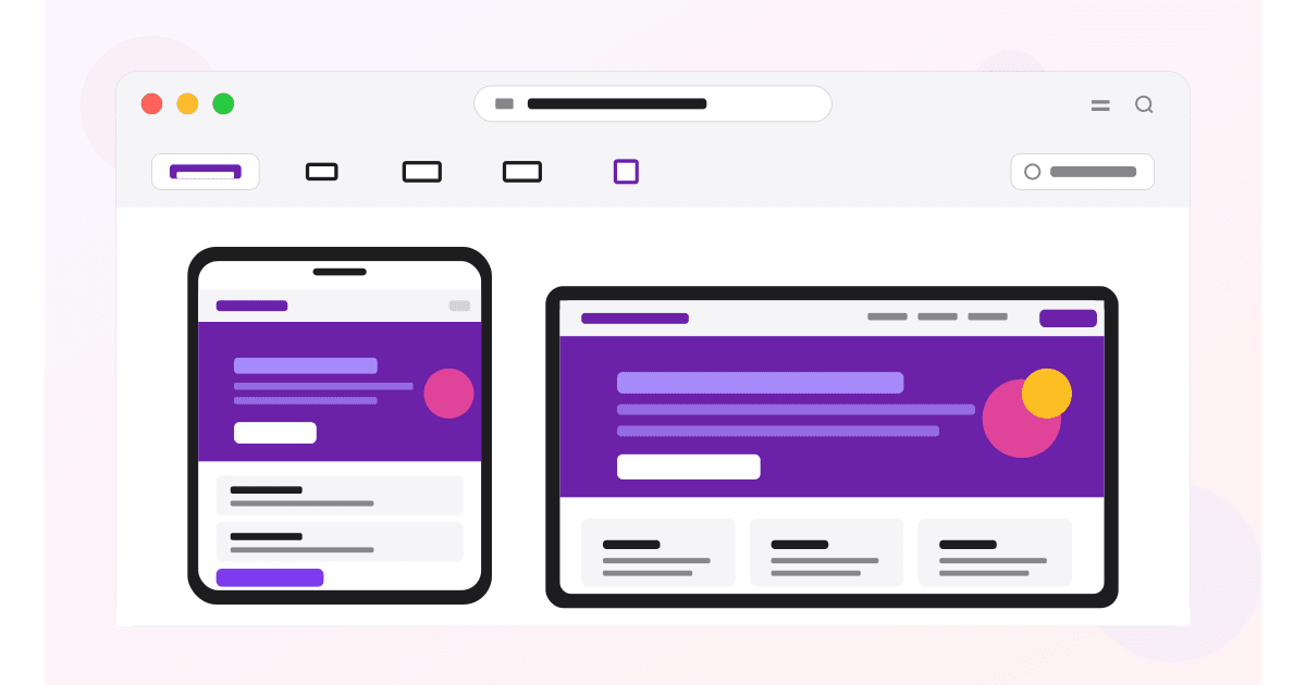
Test on 50+ real devices in one click.
Get 200 free tests when you sign up. Compare layouts side-by-side across iPhones, iPads, Pixels, and more.
Start testing on MobileViewer.io →Conclusion
Safari Responsive Design Mode is the closest thing to testing on a real iPhone without owning one. It runs WebKit, exposes iOS-specific bugs, and connects to real iPhones for live debugging. Most teams undervalue it because they default to Chrome DevTools out of habit.
The shift to make: when you finish a feature, do not just check it in Chrome. Press Cmd-Opt-R in Safari and verify there too. Combined with MobileViewer.io for multi-device sweep and a real iPhone for final QA, this workflow catches iOS bugs before your visitors do. That alone justifies the 5 minutes it takes to enable the Develop menu.
Frequently asked questions
How do I view mobile view in Safari on Mac?
Enable the Develop menu first: Safari > Settings > Advanced > check "Show features for web developers." Then open any page, click Develop > Enter Responsive Design Mode (or press Cmd-Opt-R). The window switches to a device-frame preview.
How do I enable the Develop menu in Safari?
Open Safari. Click Safari in the menu bar, choose Settings, click the Advanced tab, and check "Show features for web developers" (called "Show Develop menu in menu bar" in Safari 16 and earlier). The Develop menu appears in the menu bar between Bookmarks and Window.
What's the keyboard shortcut for Responsive Design Mode in Safari?
Cmd-Opt-R. Press it once to enter, press it again to exit. The shortcut works any time the Develop menu is enabled.
Can I inspect a real iPhone using Safari?
Yes. On the iPhone, enable Settings > Safari > Advanced > Web Inspector. Connect via USB (or Wi-Fi after pairing). On the Mac, open Safari and go to Develop > [iPhone name] > [open tab]. A Web Inspector window opens connected live to the iPhone.
Is Safari mobile view different from Chrome's mobile view?
Yes. Safari runs WebKit, the same engine iOS Safari uses. Chrome runs Blink. WebKit-specific bugs (100vh, position:sticky in overflow, certain font rendering) show up in Safari but not Chrome. Use Safari for iOS-specific testing.
Does Safari Responsive Design Mode work for iPad too?
Yes. The device presets include current iPad models (iPad Pro 13, iPad Air, iPad mini, iPad 10th gen). You can test landscape and portrait, and you can use custom widths for specific iPad sizes.
How do I test iOS-specific bugs without a Mac?
You have three options: ask a colleague with a Mac to help, use a cloud testing service like BrowserStack which provides real iOS devices via the web, or use Appetize.io which streams an iOS Simulator into your browser. Of these, BrowserStack offers the most accuracy; Appetize is the fastest to set up.
Want to see your site on more device frames? Try MobileViewer.io free. Or learn the Chrome equivalent for Android testing.