Media queries have been the foundation of responsive CSS since 2010. They ask one question: how wide is the viewport? Then they apply styles based on the answer. For 14 years, that was good enough. In 2026, it is not.
Container queries ask a different question: how wide is the component's parent? This unlocks responsive design at the component level instead of the page level, which is exactly what modern design systems need. A card component that lives in a sidebar (narrow) and the main column (wide) should look different in each context, not just at each viewport size. Media queries cannot do that. Container queries can.
This guide compares media queries and container queries with side-by-side examples, walks through browser support in 2026, and explains exactly when to use each. By the end, you will know how to migrate parts of your CSS and why most modern sites should use both together.
Here is what you will learn:
- How media queries and container queries differ in concept and syntax
- Browser support in 2026 (it is finally safe to use container queries in production)
- A side-by-side example: the same card built two ways
- Container query units (cqw, cqh, cqi, cqb) and when they save you from media queries entirely
Skip the setup. Try MobileViewer.io free.
20 free tests, no signup required. Test on 50+ real device frames in one click.
Try MobileViewer.io free →Why we needed a second kind of query
Media queries respond to the viewport. That worked when websites were essentially one-column layouts that scaled. Then design systems happened.
In a design system, the same component appears in many contexts. A product card might live in a 4-column grid on the home page, a 2-column grid on the category page, a sidebar widget on the article page, and a full-width banner on the checkout page. The viewport is the same in all four cases, but the available width for the component is wildly different.
With media queries, you have two bad options:
- Override the component per parent. Write
.sidebar .product-card { ... },.grid-4col .product-card { ... }, and so on. Specificity wars escalate. Maintenance becomes painful. - Force one layout regardless of context. Pick a "best" layout and live with it being suboptimal in the narrow and wide cases.
Container queries solve this. The card asks "how wide is my parent?" and adjusts itself. The card's CSS lives in one place. The parent's CSS does not need to know what is inside it.
This is the conceptual unlock: media queries are about the page, container queries are about the component.
Media queries: a quick refresher
A media query checks a condition about the device (usually viewport width) and applies styles when the condition is true.
Basic syntax:
/* Default styles (mobile-first) */
.button {
  padding: 8px 16px;
  font-size: 14px;
}

/* Tablet and up */
@media (min-width: 768px) {
  .button {
    padding: 10px 20px;
    font-size: 16px;
  }
}

/* Desktop and up */
@media (min-width: 1024px) {
  .button {
    padding: 12px 24px;
    font-size: 18px;
  }
}
Common breakpoints in 2026:
- 320 px: smallest iPhone (iPhone SE).
- 375 px: common phone width (iPhone 12, 13, SE).
- 768 px: iPad portrait, large phones in landscape.
- 1024 px: iPad landscape, small laptops.
- 1440 px: standard desktop.
Media query features beyond width:
min-width/max-width/width.min-height/max-height/orientation.prefers-color-scheme(light or dark).prefers-reduced-motion(accessibility).hoverandpointer(touch vs mouse).resolution(high-DPI displays).
Media queries are powerful and well-supported. They are not going away. Container queries supplement them; they do not replace them.
Container queries explained
A container query checks the size of a containing element instead of the viewport.
Two pieces required:
1. Define a containment context on the parent:
.card-wrapper {
  container-type: inline-size;
  container-name: card;
}
container-type: inline-size means the container queries can ask about the inline (horizontal) dimension. container-name is optional but helpful for clarity.
2. Query the container from the child:
.card {
  padding: 12px;
  font-size: 14px;
}

@container card (min-width: 400px) {
  .card {
    padding: 16px;
    font-size: 16px;
    display: grid;
    grid-template-columns: 1fr 2fr;
  }
}
When the .card-wrapper is at least 400 px wide, the styles inside @container apply. Importantly, this is independent of the viewport. The same wrapper at 400 px inside a narrow phone gets the same treatment as 400 px inside a wide desktop.
Container query syntax options:
container-type: size(queries both inline and block dimensions, more expensive).container-type: inline-size(queries only inline, recommended).container-type: normal(no containment, default).
Most use cases need inline-size.
Browser support in 2026: finally safe to use
Container queries shipped in all major browsers by 2023. In 2026, support is universal.
Current support:
- Chrome 105+ (August 2022).
- Safari 16+ (September 2022).
- Firefox 110+ (February 2023).
- Edge 105+ (September 2022).
In 2026, all browsers that anyone uses support container queries. The only exception is users still on iOS 15 or earlier, which by 2026 is less than 1% of iOS users.
Practical implication:
You can use container queries in production without a fallback. The era of "wait for browser support" ended in 2024. If you have not migrated any of your CSS to container queries yet, you are leaving real maintainability gains on the table.
Polyfill option (rarely needed):
A polyfill exists for older browsers, but it adds 10 KB and is unnecessary for sites that do not need to support IE11 or pre-2022 mobile Safari. Skip it unless you have a specific reason.
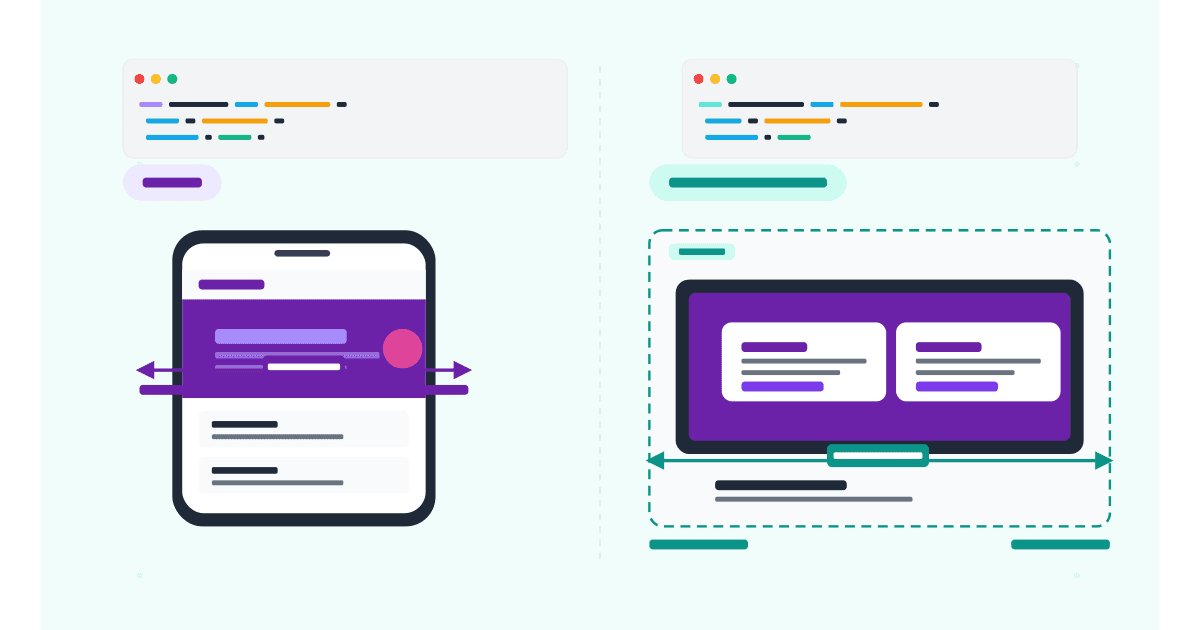
Practical example: the same card built two ways
The clearest way to understand the difference is to build the same component both ways.
The card:
A product card with an image, title, description, price, and "Add to cart" button.
Layouts needed:
- Narrow (under 300 px): vertical stack.
- Medium (300-500 px): horizontal split, image left and text right.
- Wide (over 500 px): horizontal with larger image and more padding.
With media queries (the old way)
.product-card {
  display: flex;
  flex-direction: column;
  padding: 12px;
  font-size: 14px;
}

.product-card img {
  width: 100%;
  margin-bottom: 8px;
}

@media (min-width: 768px) {
  .product-card {
    flex-direction: row;
    padding: 16px;
    font-size: 16px;
  }
  .product-card img {
    width: 40%;
    margin-bottom: 0;
    margin-right: 16px;
  }
}

@media (min-width: 1200px) {
  .product-card {
    padding: 20px;
  }
}
The problem: this card always changes at 768 px and 1200 px viewport. It does not matter if the card is in a sidebar (300 px wide) or full-width (1200 px wide). The CSS makes assumptions about the viewport that may not match the component's actual context.
With container queries (the new way)
.card-wrapper {
  container-type: inline-size;
}

.product-card {
  display: flex;
  flex-direction: column;
  padding: 12px;
  font-size: 14px;
}

.product-card img {
  width: 100%;
  margin-bottom: 8px;
}

@container (min-width: 300px) {
  .product-card {
    flex-direction: row;
    padding: 16px;
    font-size: 16px;
  }
  .product-card img {
    width: 40%;
    margin-bottom: 0;
    margin-right: 16px;
  }
}

@container (min-width: 500px) {
  .product-card {
    padding: 20px;
  }
}
Now the card adapts based on its own available space. Drop it in a sidebar; it stacks vertically. Drop it in the main content area; it goes side-by-side. Drop it in a full-width banner; it gets the larger padding. One component, four contexts, zero overrides.
The portability gain:
The container query version is reusable across the entire site. You write it once, drop the card in any context, and it just works. The media query version requires you to remember "the card only looks right between 768 px and 1200 px viewport," which is a leaky abstraction.
When to use media queries
Media queries are still the right tool for many cases. Use them when:
1. Adjusting global layouts. A site's overall grid (1 column on mobile, 2 on tablet, 4 on desktop) is a viewport-level decision. Media queries fit.
2. Typography that should scale with the viewport. Body font size that grows from 14 px to 16 px to 18 px across viewports is a viewport question.
3. Showing or hiding nav items based on viewport. A hamburger menu on mobile and an inline menu on desktop is fundamentally about the device size, not the component context.
4. Print styles. @media print adjusts the page for printing.
5. Accessibility features. @media (prefers-reduced-motion: reduce) and @media (prefers-color-scheme: dark) are about the user's preferences, not component context.
6. Page-level adjustments. Sidebars showing on desktop but hidden on mobile, header heights changing per device, footer layouts.
If the question is about the page or the user, media queries are the answer.
When to use container queries
Container queries are the right tool when:
1. Building a reusable component. Any card, widget, or module that needs to work in multiple contexts on the same page benefits from container queries.
2. Working in a design system. Components in Storybook, Figma component libraries, or your own design system should respond to context, not viewport.
3. Building a content management system layout. When editors can drop the same content block into different page templates (full-width, two-column, sidebar), container queries let the block adapt without editor input.
4. Nested responsive layouts. A media query can only look at the viewport, not at intermediate parents. Container queries unlock genuinely nested responsive design.
5. Working with content of variable width. When a panel can be expanded or collapsed by the user (a sidebar that the user can resize), container queries respond to the actual layout, not assumptions about it.
If the question is about the component's own size, container queries are the answer.
Combining both: the hybrid approach (recommended)
The strongest modern CSS uses both together.
The pattern:
- Use media queries for page-level structure (overall grid, navigation, typography).
- Use container queries for component-level responsive design.
Example:
/* Page-level grid: media query */
.layout {
  display: grid;
  grid-template-columns: 1fr;
}

@media (min-width: 1024px) {
  .layout {
    grid-template-columns: 300px 1fr;
  }
}

/* Component-level card: container query */
.card-container {
  container-type: inline-size;
}

.card {
  display: flex;
  flex-direction: column;
}

@container (min-width: 400px) {
  .card {
    flex-direction: row;
  }
}
The media query decides "is there a sidebar?" The container query decides "given how much width the card has, how should it lay out?" They do not conflict. They complement each other.
Container query units (cqw, cqh, cqi, cqb)
Beyond @container rules, container queries introduce new CSS units tied to the container's size.
The units:
cqw: 1% of the container's inline (horizontal) size.cqh: 1% of the container's block (vertical) size.cqi: 1% of the container's inline-size (synonym for cqw in horizontal writing modes).cqb: 1% of the container's block-size (synonym for cqh in horizontal writing modes).cqmin: smaller of cqi and cqb.cqmax: larger of cqi and cqb.
Use case:
Make a heading's font size scale with the card's width, not the viewport's:
.card-container {
  container-type: inline-size;
}

.card h2 {
  font-size: 5cqw; /* 5% of the container width */
}
A 400 px container produces a 20 px heading. An 800 px container produces a 40 px heading. The relationship is fluid, no breakpoints needed.
Caveat:
Be careful with large cqw values. A heading at 10cqw on a 1200 px container becomes 120 px, which is huge. Combine with clamp() to set bounds:
.card h2 {
  font-size: clamp(18px, 5cqw, 36px);
}
This caps the heading between 18 px and 36 px regardless of container size.
Common gotchas with container queries
A short list of mistakes that trip up developers new to container queries:
1. Forgetting container-type. A child element querying @container only works if an ancestor has container-type set. Without it, nothing happens silently.
2. Querying the wrong dimension. container-type: inline-size only lets you query width (in horizontal writing modes). To query height, use container-type: size, but it is more expensive and disables some layout optimizations.
3. Self-referential containers. An element cannot be both its own container and respond to itself. Set container-type on the parent, not the element you want to style.
4. Stacking container contexts. When multiple ancestors have container-type set, the closest one is queried by default. Use container-name to disambiguate.
5. Performance assumptions. Container queries are slightly more expensive than media queries at scale (thousands of containers). For typical use (dozens of containers per page), the cost is negligible.
6. Browser dev tools. Chrome and Safari DevTools show container queries in the Elements panel, but the UI is less mature than for media queries. Inspect carefully to confirm queries are firing.
Style queries: the next frontier
Beyond size-based container queries, CSS now supports container style queries. These query a parent's CSS custom properties (variables) rather than its size.
Use case:
A card component changes its style based on the theme of its parent.
.theme-wrapper {
  container-name: theme;
  --theme: dark;
}

.card {
  background: white;
  color: black;
}

@container theme style(--theme: dark) {
  .card {
    background: #1a1a1a;
    color: white;
  }
}
Browser support in 2026:
Style queries shipped in Chrome 111 (March 2023), Safari 17 (September 2023), and Firefox 117 (August 2023). Support is solid but newer than size-based container queries, so check your audience if you rely on it.
When to use:
Style queries are most useful in component libraries where the same component should adapt to different theme contexts. For typical responsive design, size-based container queries cover more cases.
Browser DevTools support for container queries
Chrome DevTools (and Safari Web Inspector) added support for container queries in 2023. Use them to debug.
In Chrome DevTools:
- Open DevTools (F12).
- Click any element with a container query rule.
- In the Styles panel, container queries appear in
@containerblocks, similar to@media. - The Computed panel shows which container query rules are active.
- Hover over a container query rule to see which ancestor element is the container.
In Safari Web Inspector:
Similar functionality. Container query rules show up grouped under @container blocks. The Layout panel highlights which ancestor element is the container for a selected child.
Testing across viewports:
Combine DevTools' Device Mode with container queries to see how components adapt as both the viewport and the container change. Resize the viewport and watch the container query rules fire or stop firing.
Migrating from media queries to container queries
You do not need to migrate everything. Migrate components, not pages.
Migration checklist:
- Identify reusable components. Cards, widgets, lists, callouts. These benefit most.
- Find the parent that defines the component's width. Wrap it in a container-type element.
- Replace breakpoint values. Where the media query said
768pxbased on viewport, the container query needs the component's natural breakpoint (often smaller, since components are smaller than viewports). - Test in each context. Drop the component in 3-4 different parents and verify each layout.
What to leave as media queries:
- Page-level grids.
- Global typography scales.
- Sidebar visibility.
- Header behavior.
- Navigation patterns.
Migrating these to container queries is unnecessary and adds complexity.
Testing responsive design across breakpoints
Whichever approach you use, testing matters.
Tools:
- Browser DevTools for quick viewport resizing.
- MobileViewer.io for multi-device preview.
- Real devices for final verification.
Process:
- Build the component in a sandbox (Storybook, CodePen, or a test page).
- Drop it in 3-4 contexts: full-width, half-width, narrow column, sidebar.
- Verify each layout looks correct.
- Test on real mobile devices to confirm container queries fire correctly on touch.
The benefit of container queries is that you can drop the same component in any context and it adapts. The testing burden shifts from "verify every viewport" to "verify every context the component lives in."
Performance: are container queries slower?
The honest answer: a tiny bit, but it does not matter for typical sites.
The benchmark:
In tests, pages with hundreds of @container rules render 1-3% slower than equivalent pages with @media rules. The browser has to track container dimensions and re-evaluate queries on layout changes.
When it matters:
- Pages with thousands of containers (rare in practice).
- Animations or transitions that change container sizes frequently.
When it does not matter:
- Typical websites with dozens of containers.
- Static layouts.
- Marketing sites, blogs, SaaS dashboards, e-commerce product pages.
Do not optimize prematurely. Use container queries where they help, and measure performance only if you actually see issues.
Test on 50+ real devices in one click.
Get 200 free tests when you sign up. Compare layouts side-by-side across iPhones, iPads, Pixels, and more.
Start testing on MobileViewer.io →Conclusion
Media queries answer "how big is the page?" Container queries answer "how big is my component?" Both questions are valid; both answers shape modern responsive design. The teams that get the most out of CSS in 2026 use them together: media queries for global structure, container queries for component-level adaptability.
If you have not used container queries in production, this is the year to start. Browser support is complete. The performance cost is negligible. The maintainability gain on a design system is huge. Pick one reusable component on your site, migrate it to container queries, and you will quickly see why this is the future of CSS layout.
Frequently asked questions
What is the main difference between media queries and container queries?
Media queries respond to the viewport (the browser window). Container queries respond to a parent element's size. Media queries are about the page; container queries are about the component.
Are container queries production-ready in 2026?
Yes. All major browsers (Chrome, Safari, Firefox, Edge) have supported container queries since 2022-2023. In 2026, support is universal. You can use container queries in production without fallbacks.
Should I replace media queries with container queries?
No. Use both. Media queries handle page-level structure (grid layouts, typography scales, navigation). Container queries handle component-level adaptability. The strongest CSS combines them.
How do I set up a container query?
Set container-type: inline-size on a parent element. Then query that parent from a descendant using @container (min-width: 400px) { ... }. The styles inside the rule apply when the parent matches the condition.
What are container query units like cqw and cqh?
They are size units tied to the container's dimensions. 1cqw equals 1% of the container's inline (horizontal) size. They let you make typography and spacing fluid based on container size, similar to vw and vh for viewports.
Do container queries work with flexbox and grid?
Yes. Container queries work inside any layout system. You can change flex-direction based on container size, or change grid-template-columns, or any other property.
Are container queries slower than media queries?
Marginally, in pathological cases (thousands of containers). For typical sites with dozens of containers, the difference is unmeasurable. Do not avoid container queries based on performance concerns; measure before optimizing.
Can I nest container queries?
Yes. You can have a container inside another container, and each one is independently queried. Use container-name to specify which container a @container rule targets when nesting.
Need to test your responsive design? Try MobileViewer.io free for instant multi-device previews. Or read our guides to viewing mobile in Chrome and Safari Responsive Design Mode.