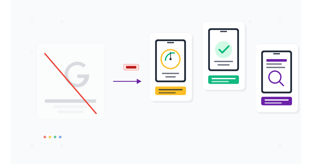
You opened the old Google Mobile-Friendly Test URL, hoping to check a new landing page. The page returned an error or redirected you to PageSpeed Insights. That is not a glitch. Google quietly retired the Mobile-Friendly Test tool in December 2023, and in 2026 it remains gone.
The criteria the tool checked (mobile usability, no horizontal scroll, font size, tap targets, viewport meta tag) still matter for SEO. Google's mobile-first indexing has been universal since July 2024, so a site that fails the old criteria still ranks poorly today. But the standalone tool that gave you a single yes/no answer is no longer maintained.
This guide covers what happened to the Google Mobile-Friendly Test, what replaced parts of it, and the 7 best alternatives in 2026 that actually deliver more value than the original tool did.
Here is what you will learn:
- Why Google retired the Mobile-Friendly Test and what they replaced parts of it with
- 7 free and paid alternatives, ranked by what they do best
- A 4-tool audit workflow that covers everything the old tool did, plus more
- Which mobile-friendly criteria still affect rankings in 2026
Skip the setup. Try MobileViewer.io free.
20 free tests, no signup required. Test on 50+ real device frames in one click.
Try MobileViewer.io free →What happened to the Google Mobile-Friendly Test
The Google Mobile-Friendly Test was a free tool at search.google.com/test/mobile-friendly. You pasted any URL, Google scanned it with Googlebot's mobile crawler, and the tool returned "Page is mobile-friendly" or "Page is not mobile-friendly" along with a list of issues.
In December 2023, Google announced the tool would be retired. By early 2024, the URL stopped working reliably. By the end of 2024, the tool was fully removed.
What Google said:
In their announcement on the Search Central blog, Google framed the deprecation as part of a larger consolidation. The Mobile-Friendly Test's functionality, they argued, was redundant with other tools (PageSpeed Insights, Search Console). The Mobile Usability report in Search Console was also deprecated at the same time, indicating Google sees mobile-friendliness as embedded in broader metrics rather than a standalone signal.
What this means in practice:
The old single yes/no checker is gone. The criteria it tested (viewport meta tag, font size, tap targets, no horizontal scroll, no incompatible plugins) still matter. Google still indexes mobile-first, still uses Core Web Vitals as a ranking signal, and still cares about mobile usability. The change is in how you check, not whether mobile-friendliness matters.
Why Google retired it (and what replaced parts of it)
Three reasons Google likely retired the tool:
1. Mobile-first indexing is universal.
When Google rolled out mobile-first indexing in 2018, the Mobile-Friendly Test was useful because some sites had separate mobile versions. By 2024, every site is indexed mobile-first by default. The tool was answering a question that had become obvious.
2. The pass/fail was misleading.
A site could pass the Mobile-Friendly Test and still have major mobile UX problems (slow load, hidden content, intrusive popups). Conversely, a site could fail on a minor technicality (one element with a small tap target) and still be perfectly usable. Lighthouse and PageSpeed Insights provide more nuanced scoring.
3. Consolidation reduces maintenance burden.
PageSpeed Insights includes mobile-friendliness checks. Lighthouse, the underlying audit engine, runs locally and as part of Chrome DevTools. Search Console reports indexing issues. Maintaining a fourth standalone tool with overlapping functionality was redundant.
What replaced parts of it:
- PageSpeed Insights: still includes mobile usability checks, plus Core Web Vitals and full Lighthouse audit.
- Lighthouse (in Chrome DevTools): can run mobile audits locally with the same scoring.
- Search Console: Page Experience report shows mobile-related issues for indexed pages.
These three together do everything the old tool did, plus more. The downside is they require slightly more setup; you cannot just paste a URL and get a single answer.
What you still need to check (the criteria haven't changed)
The mobile-friendly criteria Google used in the original tool are still the criteria that matter for mobile-first indexing.
The checklist:
- Viewport meta tag is set. Should be
<meta name="viewport" content="width=device-width, initial-scale=1">in your HTML head. - No horizontal scroll. Content fits the viewport at 320 px, 375 px, and 414 px widths.
- Tap targets are 48 x 48 dp minimum. Buttons and links big enough to tap with a thumb.
- Body font is 16 px or larger. Smaller fonts trigger iOS auto-zoom and are hard to read.
- No Flash or other incompatible plugins. Should be a given in 2026, but legacy sites sometimes still have these.
- Content uses available width. No fixed-width layouts that force horizontal scroll on small screens.
- Sufficient line height. Tight line spacing on mobile makes long text painful to read.
If a page passes these 7 checks, it would have passed the old Google Mobile-Friendly Test. Google still uses these criteria in mobile-first indexing.
Alternative 1: Google PageSpeed Insights (mobile tab)
PageSpeed Insights is the official replacement most Google product teams point you toward.
How to use it:
- Go to pagespeed.web.dev.
- Paste your URL and click Analyze.
- Click the Mobile tab.
- Scroll to the Diagnostics and Audits sections.
What it shows for mobile-friendliness:
- Core Web Vitals (LCP, INP, CLS) measured on real Chrome users (when enough field data exists).
- Lighthouse audit including mobile usability issues.
- Screenshot of the page as rendered on a mobile device.
- Specific recommendations like "Image elements do not have explicit width and height" or "Document does not have a meta description."
Strengths:
- Free, no install.
- Combines field data (real-user Chrome data) with lab data (Lighthouse).
- Same tool Google uses internally.
Weaknesses:
- Does not show a visual rendering of the page on different device frames.
- Field data only available for sites with significant Chrome traffic.
- The mobile usability checks are buried inside larger audits, not surfaced as a single pass/fail.
For SEO teams replacing the old Mobile-Friendly Test, PageSpeed Insights is the closest 1:1 replacement.
Alternative 2: Lighthouse audits (in Chrome DevTools)
Lighthouse is the open-source audit engine that powers PageSpeed Insights. You can run it locally in Chrome DevTools.
How to use it:
- Open the page in Chrome.
- Press F12 to open DevTools.
- Click the Lighthouse tab.
- Check Mobile as the device.
- Check the categories: Performance, Accessibility, Best Practices, SEO.
- Click Analyze page load.
What you get:
- A score (0-100) in each category.
- Specific issues with recommended fixes.
- Filmstrip of the page loading on a simulated mobile device.
- A downloadable HTML or JSON report.
Strengths:
- Runs locally, no third-party.
- More configurable than PageSpeed Insights.
- Includes all PageSpeed Insights audits plus a few extras.
- Free and built into Chrome.
Weaknesses:
- Lab-only data (no real-user Chrome data).
- Results vary between runs depending on local network and CPU. Run 3-5 times and take the median.
- Heavier to use than a single URL paste.
For developers, Lighthouse is the right tool. For non-developers, PageSpeed Insights is more accessible.
Alternative 3: Google Search Console Page Experience report
Search Console gives you what no third-party tool can: how Google actually sees your site, with historical data.
How to access:
- Sign in to search.google.com/search-console.
- Select your verified property.
- Click Page experience in the left sidebar.
What you get:
- Pages broken down by mobile usability status.
- Core Web Vitals (LCP, INP, CLS) for mobile, with the percentage of URLs passing each threshold.
- HTTPS status.
- Pages with intrusive interstitials (mobile popup penalty).
- Historical trends over 90 days.
Strengths:
- Real Googlebot data, not third-party simulation.
- Shows trends, so you can see if a deploy made things worse.
- Free.
- Only tool that actually tells you what Google itself flagged.
Weaknesses:
- Only works for properties you have verified in Search Console.
- Data refresh is slow (24-48 hour delay).
- Aggregate view, not per-URL on demand.
Every site owner should have this set up. The signal-to-noise ratio is excellent.
Alternative 4: MobileViewer.io (free, no signup for first 20 tests)
The original Google Mobile-Friendly Test had one thing competitors did not: a screenshot of the page rendered as Googlebot saw it. That screenshot answered "does my page actually look right on mobile?" in a way audits cannot.
MobileViewer.io restores and extends that visual answer.
How to use it:
- Open mobileviewer.io.
- Paste your URL.
- Pick the devices you want to test: iPhone 16 Pro Max, Galaxy S24, iPad Pro, Pixel 8.
- The site renders inside each device frame at the correct viewport.
Strengths:
- Visual rendering on 50+ device frames.
- Free tier covers 20 tests, no signup required.
- Side-by-side device comparison.
- Geographic emulation for testing localized sites.
- Shareable links.
Weaknesses:
- Does not score Core Web Vitals (use PageSpeed Insights for that).
- Browser-based emulation, not real WebKit on iPhone.
The right way to use MobileViewer.io is as the visual layer of your audit. PageSpeed Insights tells you the numbers. MobileViewer.io shows you what the page looks like. Pair them.
Alternative 5: BrowserStack Responsive
BrowserStack offers a free responsive testing tool at browserstack.com/responsive, plus a paid product with real device cloud.
Free tool:
- Open browserstack.com/responsive.
- Paste your URL.
- See the page rendered across various device sizes.
Strengths:
- Free for basic checks.
- Multiple devices displayed simultaneously.
- Paid plan offers real device cloud for full interaction testing.
Weaknesses:
- Free tier shows static screenshots, not interactive sessions.
- For interaction testing, you need a paid subscription ($29-39/month).
- Heavier interface than MobileViewer.io.
For SEO teams, BrowserStack's free responsive tool is a decent backup. For QA teams that need real-device testing, BrowserStack's paid product is one of the strongest options.
Alternative 6: LambdaTest LT Browser
LambdaTest's LT Browser is a free desktop application that brings multi-device preview to your local machine.
How to use it:
- Download LT Browser from lambdatest.com/lt-browser.
- Install on Mac, Windows, or Linux.
- Open and enter the URL.
- Choose from 50+ device presets.
Strengths:
- Free desktop app.
- Local performance (faster than web-based tools).
- Built-in screenshot, recording, and screen capture.
Weaknesses:
- Requires a download and install.
- Free tier limited to specific number of sessions; paid tier removes limits.
- Like other emulator tools, browser-based rendering, not real device WebKit.
LT Browser is a strong choice if you prefer a desktop app over a web-based tool. The free tier covers most light testing needs.
Alternative 7: Chrome DevTools Device Mode
You already have Chrome DevTools installed. Use it as a free, instant mobile-friendly checker.
Steps:
- Open the page in Chrome.
- Press F12.
- Press Cmd-Shift-M (Mac) or Ctrl-Shift-M (Windows) to toggle Device Mode.
- Choose iPhone 15 Pro or another device preset.
- Scroll, click, and verify the page works at mobile size.
For audits:
Run Lighthouse from the Lighthouse tab to get a mobile usability score.
Strengths:
- Free, instant, already installed.
- Combined with Lighthouse for a full audit.
Weaknesses:
- Emulates only one device at a time.
- Chrome's Blink engine, not iOS Safari's WebKit.
For more on Chrome DevTools' mobile features, see our Chrome mobile view guide.
Comparison table: which alternative does what
The right tool depends on what you are replacing.
| Tool | Visual rendering | Pass/fail score | Performance audit | Free tier |
|---|---|---|---|---|
| PageSpeed Insights | Yes (one device) | Yes (Lighthouse) | Yes | Free |
| Lighthouse (DevTools) | Yes (filmstrip) | Yes (Lighthouse) | Yes | Free |
| Search Console | No | Status flags | Yes (CWV) | Free |
| MobileViewer.io | Yes (50+ devices) | No | No | 20 free |
| BrowserStack Responsive | Yes | No | No | Free tier |
| LambdaTest LT Browser | Yes (50+ devices) | No | No | Free tier |
| Chrome DevTools Device Mode | Yes (one device) | Via Lighthouse | Via Lighthouse | Free |
The pattern: scoring tools (PageSpeed Insights, Lighthouse) replace the old pass/fail. Visual tools (MobileViewer.io, BrowserStack, LambdaTest) replace the rendering aspect. Search Console adds the Google-specific data the others cannot show.
What the original Google Mobile-Friendly Test actually checked
For context on what you are replacing, the original tool ran six specific checks.
1. Viewport meta tag. Page had to include <meta name="viewport" content="width=device-width"> to instruct the browser to scale the viewport to the device width.
2. Text readability. Body text had to be at least 12 px (effectively 16 px after scaling, since the viewport meta tag was set). Smaller text triggered "Text too small to read."
3. Tap targets. Buttons and links had to be sized for fingers, with at least 48 px between adjacent tap areas. Closer spacing triggered "Clickable elements too close together."
4. Content width. Page content had to fit the viewport without horizontal scroll. Content wider than the viewport triggered "Content wider than screen."
5. Incompatible plugins. Flash and similar plugins not supported on mobile triggered "Uses incompatible plugins."
6. Rendered preview. The tool included a screenshot showing how Googlebot rendered the page on a mobile device. This visual was often more useful than the pass/fail.
In 2026, the modern audit tools cover all six checks, but they spread the data across multiple panels. PageSpeed Insights handles 1-5 inside Lighthouse audits. MobileViewer.io handles 6 (the visual rendering) better than the original tool did, with 50+ device frames instead of one.
Additional free tools worth knowing
Beyond the seven main alternatives, a few specialized tools cover edge cases.
WebPageTest (webpagetest.org): Free, in-depth performance testing from real devices in real locations. More detailed than PageSpeed Insights for performance debugging but slower to run.
GTmetrix: Combines Lighthouse with additional waterfall and visual analysis. Free tier shows desktop only; mobile requires signup.
Pingdom Tools: Speed testing with location selection. Useful for verifying performance from specific geographies.
Google Search Central tools (the broader suite): Mobile Usability is gone, but URL Inspection (in Search Console) shows you exactly how Googlebot rendered a specific URL on mobile, including the screenshot.
For most teams, PageSpeed Insights plus MobileViewer.io plus Search Console covers daily needs. The specialized tools come into play for performance audits and geographic testing.
A step-by-step replacement audit workflow
For any single URL, here is the 5-minute audit that fully replaces the Mobile-Friendly Test.
Step 1: PageSpeed Insights (1 minute)
Paste URL, click Mobile tab, note the score and top 3 issues.
Step 2: MobileViewer.io (1 minute)
Paste URL, view on iPhone SE (smallest), iPhone 16 Pro Max (current), Galaxy S24 (Android). Scroll through each. Note visual bugs.
Step 3: Chrome DevTools Lighthouse (2 minutes)
Open the page in Chrome. F12 > Lighthouse > Mobile > Analyze. Save report. Note any issues PageSpeed Insights missed.
Step 4: Search Console check (30 seconds)
If the URL is indexed, check Search Console > Page experience for any flags on that URL or its category.
Step 5: Real iPhone (30 seconds, if available)
Pull out your phone, open the URL, tap through. Confirms what the tools showed.
Total: 5 minutes per URL. More thorough than the old Mobile-Friendly Test was, and you have actionable specifics, not just a yes/no.
Test on 50+ real devices in one click.
Get 200 free tests when you sign up. Compare layouts side-by-side across iPhones, iPads, Pixels, and more.
Start testing on MobileViewer.io →What ranking factors are still tied to mobile-friendliness in 2026
The criteria the old Mobile-Friendly Test checked are still ranking signals. They just live inside other reports now.
1. Mobile-first indexing. Universal since July 2024. The mobile version of your page is what Google ranks. Covered in our mobile-first indexing guide.
2. Core Web Vitals. LCP under 2.5s, INP under 200ms, CLS under 0.1. Mobile values are what matter for mobile-first ranking.
3. Page experience signal. Google's ranking factor that bundles Core Web Vitals, HTTPS, no intrusive interstitials, and mobile-friendliness.
4. Intrusive interstitial penalty. Mobile popups that block content trigger a ranking demotion.
5. HTTPS. Long-standing requirement. Sites without HTTPS rank worse and are flagged in browsers.
6. Safe browsing. Sites with malware or phishing flags are de-ranked entirely.
These six together define mobile SEO in 2026. The Mobile-Friendly Test tool is gone; the criteria are not.
Conclusion
The Google Mobile-Friendly Test was a useful single-purpose tool when the answer to "is this mobile-friendly?" was binary. In 2026, mobile-friendliness is a multidimensional question (performance, layout, intrusiveness, indexing), and no single tool covers all of it. The replacement is a stack: PageSpeed Insights for scores, MobileViewer.io for visual verification, Search Console for Google's own view, Chrome DevTools for deep-dive audits.
The 5-minute audit workflow above is the practical 2026 replacement. Run it on every new page before publishing. Run it again 7 days after publishing to catch ranking issues. That cadence catches what the old tool would have caught, plus what it could not.
Frequently asked questions
What replaced the Google Mobile-Friendly Test?
Three Google tools cover what it did: PageSpeed Insights (for scoring), Lighthouse in Chrome DevTools (for detailed audits), and Search Console's Page Experience report (for indexed pages). Combined, they replace the original tool's functionality with more depth.
Is the Google Mobile-Friendly Test still available?
No. Google retired it in December 2023 and removed the URL in 2024. If you find references to search.google.com/test/mobile-friendly, the URL no longer works. Use PageSpeed Insights at pagespeed.web.dev instead.
How do I check if my site is mobile friendly in 2026?
Run PageSpeed Insights on the URL (mobile tab) for a score. Open the URL in MobileViewer.io to verify visual rendering on real device frames. Check Search Console for any flagged mobile usability issues. This combination covers everything the old tool did, with more detail.
Does PageSpeed Insights check mobile friendliness?
Yes. The mobile tab in PageSpeed Insights runs a full Lighthouse audit including mobile usability checks: viewport meta tag, font size, tap targets, no horizontal scroll. The findings appear in the Diagnostics and Audits sections.
Can I still use the old mobile-friendly test URL?
No. The URL is deprecated. Some search results still link to it, but the page either errors or redirects. Update any bookmarks or documentation pointing to it.
How does Google decide if my site is mobile friendly now?
Google evaluates mobile-friendliness as part of the broader Page Experience signal. Factors include Core Web Vitals (mobile), HTTPS, no intrusive interstitials, and basic mobile usability (font size, tap targets, no horizontal scroll). The signal is now a continuous rather than binary one.
What's the best free mobile-friendly test in 2026?
For scoring: PageSpeed Insights. For visual rendering: MobileViewer.io. For Google's own data: Search Console. Use all three; they answer different questions. If you want a single tool that gets close to the old experience, MobileViewer.io is the closest visual replacement.
Want the visual mobile check the old Google tool gave you? Try MobileViewer.io free. Or read our deep dive on mobile-first indexing in 2026.