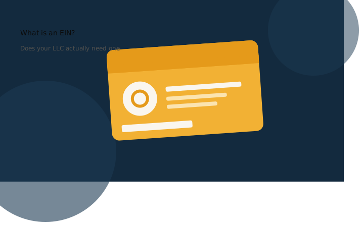
What Is an EIN and Does Your LLC Need One?
Learn what an EIN is, why it matters for your LLC, who must have one, and how to apply for free with this simple step-by-step guide for owners.

Tips, tutorials, and insights on responsive design, cross-device testing, and web development.
Learn what an EIN is, why it matters for your LLC, who must have one, and how to apply for free with this simple step-by-step guide for owners.
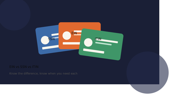
Learn the clear differences between an EIN, SSN, and ITIN, who needs each number, and exactly when your LLC or personal taxes require one to file.

A mobile UX testing checklist for the parts that don't show up in DevTools: getting video framed, captioned, and load-tested for small screens, and making sure your pop-ups and permission prompts don't read like phishing scams.

How healthcare organizations turn complex, scattered records into clean, actionable insights through data integration, machine learning, visualization, centralization, FHIR interoperability, RBAC, and structured reporting.
Test any website on an iPhone-sized frame without owning an iPhone. Compare 5 simulator options: Xcode, MobileViewer.io, BrowserStack, more.
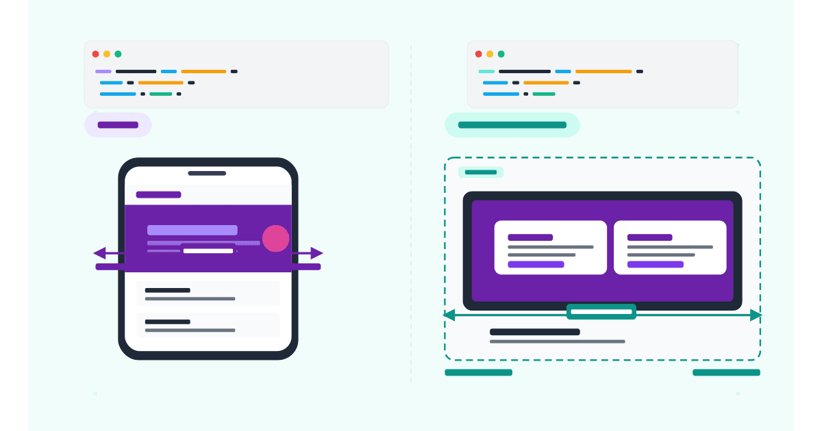
Media queries adapt to the viewport; container queries adapt to the parent. Side-by-side examples, browser support, and when to use each in 2026.
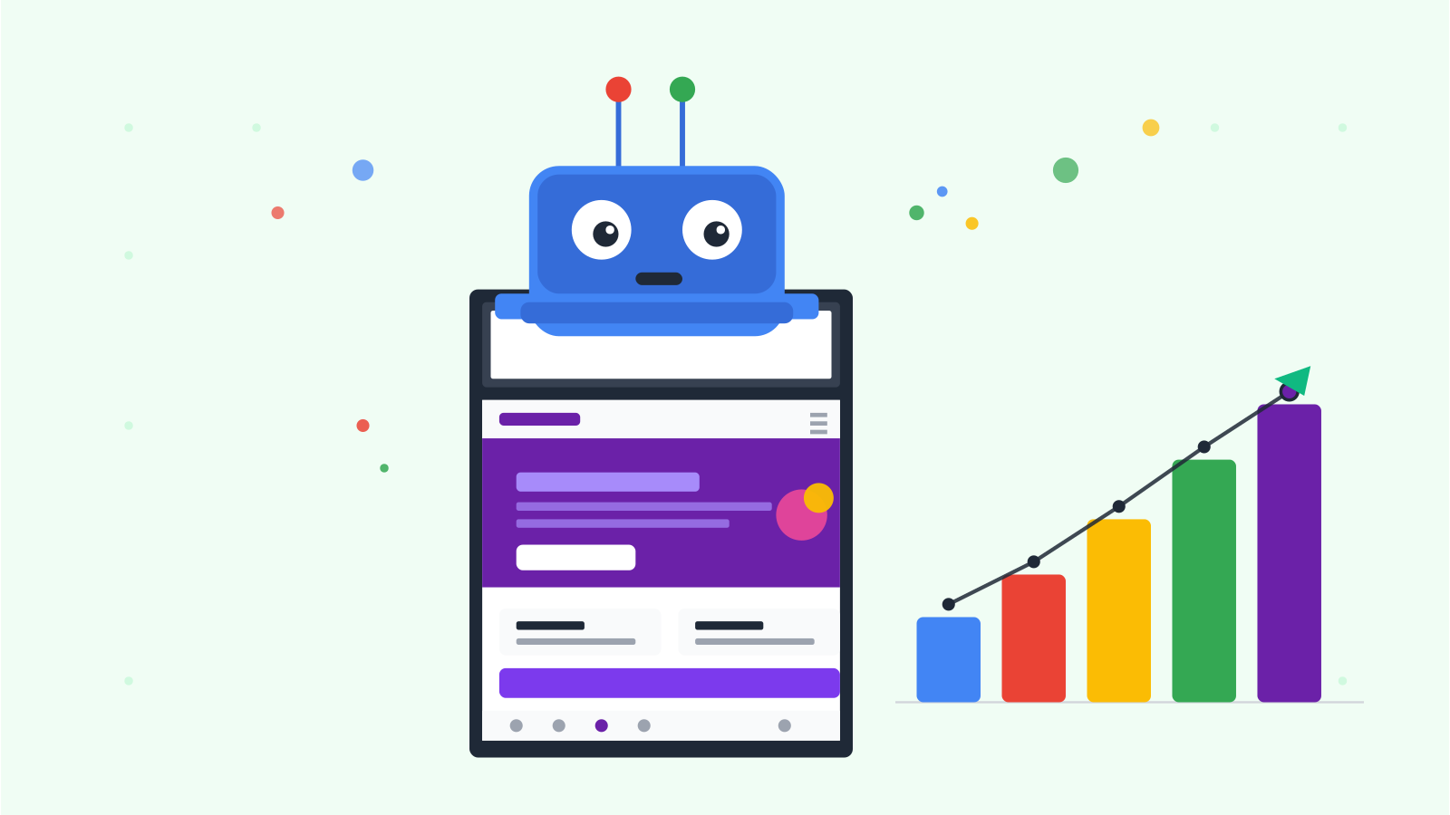
Google's mobile-first indexing fully completed in 2024. Here's how it affects rankings in 2026 and the 10-point checklist to optimize your site.
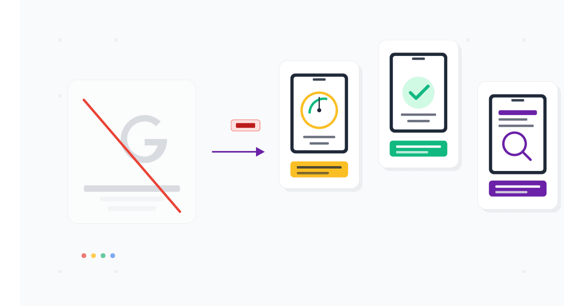
Google retired the Mobile-Friendly Test in December 2023. Here are 7 alternatives that check mobile usability, speed, and real-device rendering.
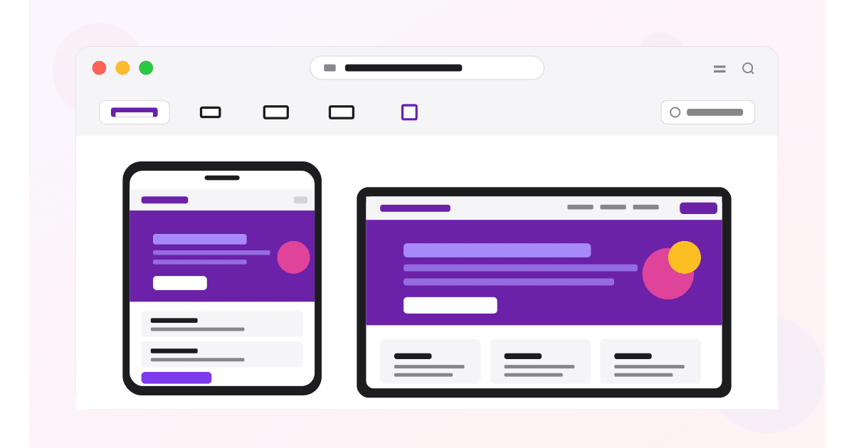
Safari Responsive Design Mode lets you test iPhone & iPad layouts on Mac. Enable the Develop menu, switch devices, and inspect real iPhones.