Media Queries vs Container Queries: Which One Should You Use in 2026?
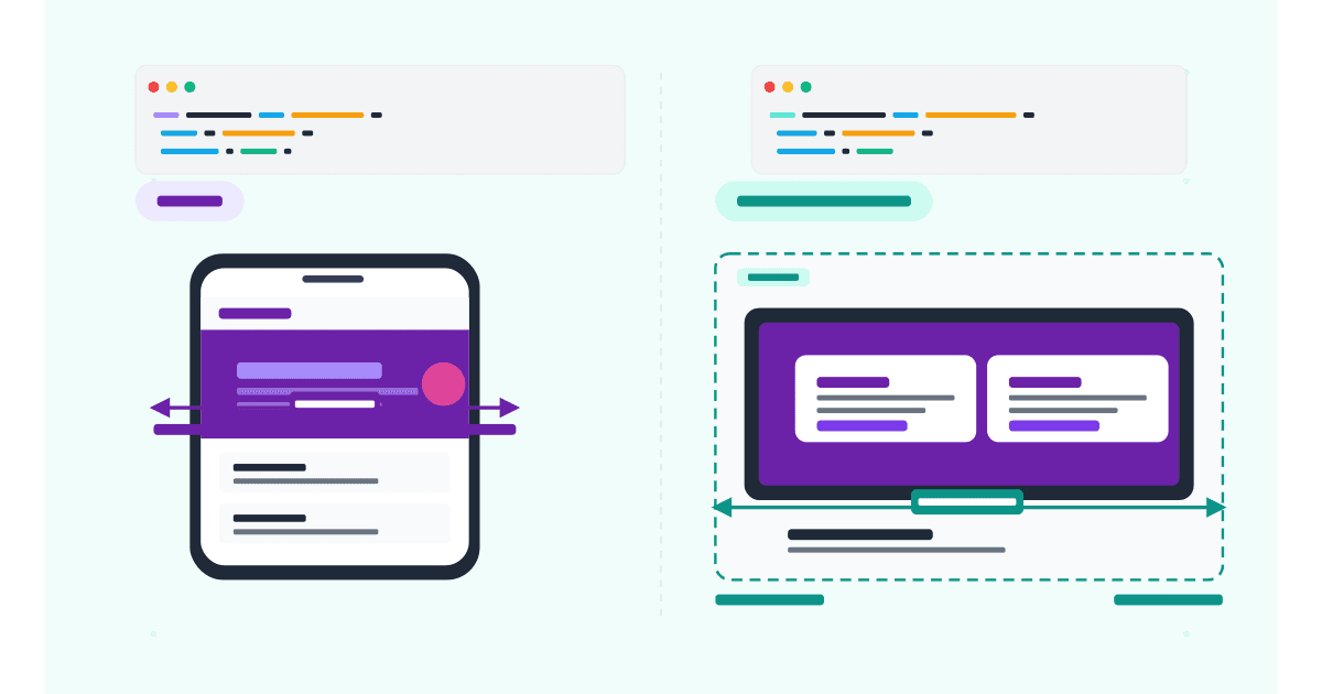
Media queries adapt to the viewport; container queries adapt to the parent. Side-by-side examples, browser support, and when to use each in 2026.
Articles in CSS.
Media queries adapt to the viewport; container queries adapt to the parent. Side-by-side examples, browser support, and when to use each in 2026.
Responsive typography ensures text looks great and remains readable across all screen sizes, from smartphones to large desktop monitors. Instead…
CSS breakpoints are specific screen widths where your website’s layout changes to better fit different devices. They are the foundation…
Deep dive into CSS breakpoints, media queries, and how to choose the right breakpoints for your project.