Squarespace sells the idea that your site is mobile-friendly by default. That is half-true. The platform's themes scale to small screens, but the result is rarely the design you would choose if you were building for mobile specifically. Headlines truncate. Buttons stack awkwardly. Images that were beautiful on a 27-inch monitor lose their focal point on a phone.
Working with Squarespace mobile view in 2026 means understanding what the platform automates for you, what it does not, and where the editor's preview tells you the truth versus where it does not. This guide walks through every mobile control in Squarespace 7.1 and 7.0, the Fluid Engine workflow, mobile typography, the mobile menu, and the external tools that catch what the editor hides.
Here is what you will learn:
- Where the Squarespace mobile view preview lives in 7.1 and in 7.0
- How to edit mobile-specific layouts in Fluid Engine
- The Squarespace-specific bugs that only show up on real devices
- A 10-item Squarespace mobile QA checklist before publishing
Skip the setup. Try MobileViewer.io free.
20 free tests, no signup required. Test on 50+ real device frames in one click.
Try MobileViewer.io free →How Squarespace handles mobile responsive design
Squarespace ships three different responsive approaches depending on which version you are on.
Squarespace 7.0 (legacy): Sites built before 2020 use template-based responsive design. The mobile layout is dictated by the template's CSS, and you have limited per-device control. Changes you make in the editor apply to both desktop and mobile.
Squarespace 7.1 with Classic Editor: This is the most common setup for sites built between 2020 and 2022. The editor lets you preview mobile but not edit per-device. The mobile layout is auto-generated from the desktop layout based on Squarespace's responsive rules.
Squarespace 7.1 with Fluid Engine: Released in mid-2022, Fluid Engine introduces per-device layouts. You can drag blocks into a separate mobile arrangement, hide sections per device, and adjust spacing independently. This is the only version where you have true mobile-specific design control.
In 2026, most new Squarespace sites are built on 7.1 with Fluid Engine. If you inherited an older site, the workflows differ. Throughout this guide we will call out which version each technique applies to.
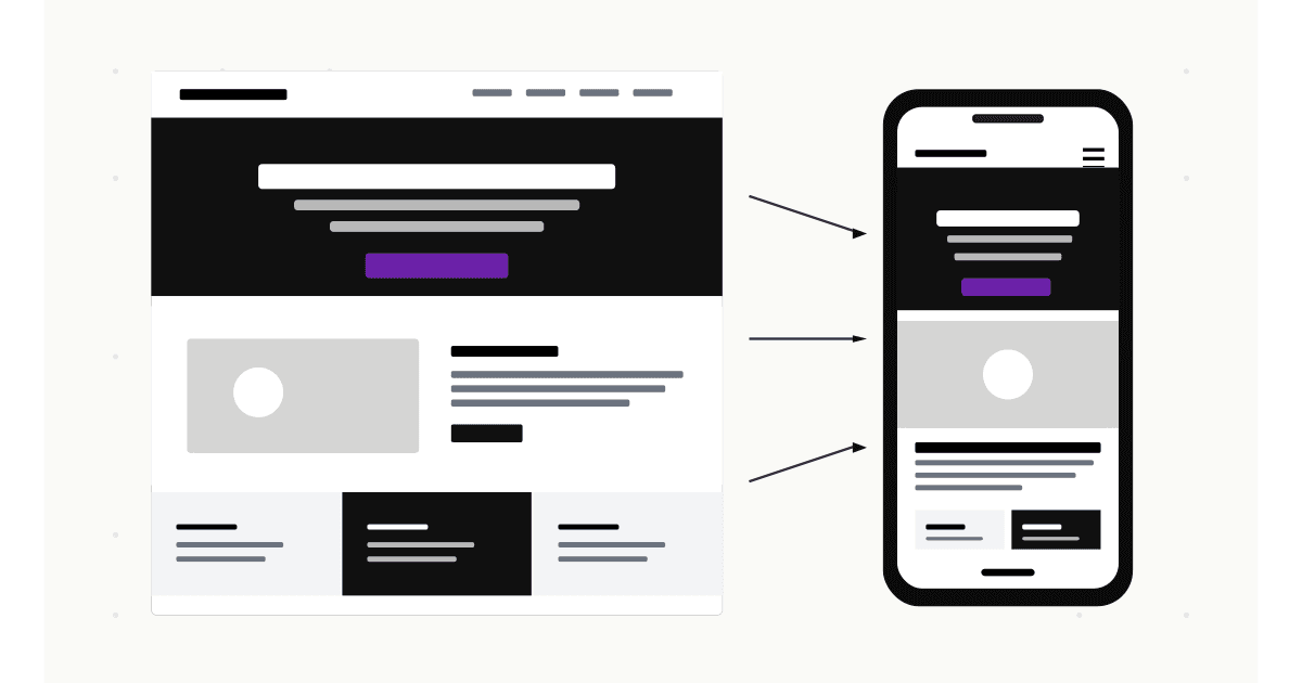
Where to find mobile preview in Squarespace 7.1
The mobile preview in Squarespace 7.1 is in the same place whether you use Classic Editor or Fluid Engine, but the editing behavior is different.
Steps:
- Open any page in the editor (click Edit or Edit Section).
- At the top of the editor, you will see three device icons: desktop, tablet, mobile.
- Click the phone icon to switch to mobile preview.
- The canvas resizes to approximately 375 px wide, simulating an iPhone.
Classic Editor in 7.1: The mobile preview shows the auto-generated mobile layout. You cannot edit it independently; you can only adjust global styles (Site Styles) that apply to both desktop and mobile.
Fluid Engine in 7.1: Switching to the mobile view opens an editable mobile canvas. Blocks can be moved, resized, and reordered without affecting the desktop layout. This is the powerful feature unique to Fluid Engine.
To check which editor a specific section uses, hover over the section. If it says "Fluid Engine" in the section toolbar, you have per-device control. If it does not, the section is on Classic Editor and follows the auto-generated mobile rules.
Where to find mobile preview in Squarespace 7.0
Squarespace 7.0 sites have a more limited mobile workflow.
Steps:
- Open any page in the editor.
- In the top toolbar, click the mobile icon (next to the desktop and tablet icons).
- The preview resizes. You can navigate the site in mobile preview mode but cannot make per-device edits.
Limitations of 7.0:
- No per-device layout. Mobile is auto-generated from desktop.
- No per-section visibility toggles. To hide an element on mobile, you must use custom CSS with media queries.
- Some 7.0 templates handle mobile differently. Brine-family templates are more flexible than Bedford-family.
If you are on 7.0 and considering moving to 7.1, Squarespace's official migration documentation lays out the process. For most sites, migrating unlocks Fluid Engine and is worth the effort.
Editing the mobile layout in Fluid Engine
Fluid Engine is the only place in Squarespace where you can build a truly different mobile layout from desktop.
Steps:
- Open a Fluid Engine section in the editor.
- Switch to mobile view (phone icon).
- Drag any block to a new position. The grid is 8 columns on mobile.
- Resize blocks by dragging the corners.
- Add new blocks via the + icon (mobile-only blocks will not appear on desktop unless you also add them there).
Key rules to remember:
- Changes on mobile do not auto-sync to desktop. You can rearrange the entire mobile section without touching desktop.
- Changes on desktop also do not auto-sync to mobile in Fluid Engine. This is the opposite of Classic Editor.
- The vertical stacking on mobile follows the visual order in the mobile canvas, not the desktop canvas.
Common Fluid Engine mobile mistakes:
- Forgetting to switch back to desktop after editing mobile. You publish mobile changes thinking they applied to both, then realize desktop is unchanged.
- Leaving empty grid rows. A block deleted on mobile but still occupying a row leaves a gap. Resize or move adjacent blocks to fill the space.
- Over-stacking on mobile. A 3-column desktop section squeezed into a 1-column mobile section becomes a tall scroll. Consider hiding some columns on mobile instead of stacking everything.
The Fluid Engine mobile editor is powerful, but it rewards intentional design. Plan the mobile layout before you start dragging.
Editing fonts and headings for mobile
Squarespace's responsive typography is one of its better automated features, but the defaults are not always right.
For 7.1 sites:
- Open Site Styles (paintbrush icon in the editor).
- Click Fonts > Headings.
- Each heading level (H1, H2, H3, H4) has a separate font, weight, size, line height, and letter spacing. There is also a scale slider for mobile.
- Adjust the mobile scale to make headings smaller (or larger) on phone-size viewports without affecting desktop.
Recommended mobile font sizes in 2026:
- Body: 16 px (smaller and iOS Safari will zoom on focus, which breaks layout).
- H1: 28-40 px on a 320-375 px viewport.
- H2: 22-28 px.
- H3: 18-22 px.
For 7.0 sites: Site Styles is more limited. Mobile font sizes scale automatically based on the desktop size. If you need different mobile typography, you will need custom CSS:
@media (max-width: 640px) {
  h1 { font-size: 2rem !important; }
  h2 { font-size: 1.5rem !important; }
  p { font-size: 1rem !important; }
}
Test the changes in mobile preview and on a real device. iOS Safari renders fonts slightly differently from Chrome.
Hiding and showing elements on mobile only
This is one of the most common mobile customizations. The approach depends on your editor.
Fluid Engine (7.1):
Each block in Fluid Engine has a visibility toggle. Click the block, look for the eye icon in the block toolbar, and choose "Hide on desktop" or "Hide on mobile." This is the cleanest approach and does not require custom CSS.
Classic Editor (7.1) and 7.0:
No native visibility toggle. Use custom CSS with display rules:
/* Hide on mobile */
@media (max-width: 640px) {
  .my-element { display: none !important; }
}

/* Hide on desktop */
@media (min-width: 641px) {
  .my-element { display: none !important; }
}
To target a specific element, use the Squarespace Page Header Code Injection to add a custom class, or use the element's existing ID via the browser inspector.
Common use cases for visibility toggling:
- A decorative image that fits desktop but clutters mobile.
- A long subtitle that works on desktop but is too small to read on mobile (replace with a shorter mobile-only version).
- A multi-column layout where the third column adds value on desktop but is redundant on mobile.
Use this sparingly. Every element you hide on mobile is a small piece of content Google does not see in the mobile-first index.
Customizing the Squarespace mobile menu
The mobile menu is one of the most important elements of any Squarespace site. It is also one of the most customized.
Default Squarespace mobile menus come in two styles:
- Drawer: slides in from the side.
- Full-screen overlay: covers the entire viewport.
To switch styles in 7.1:
- Open Site Styles.
- Look for Header > Mobile menu style.
- Choose between the available options (varies by site).
To customize colors, fonts, and spacing:
- Site Styles > Colors. The mobile menu inherits from your site palette.
- Site Styles > Fonts. Set the navigation font separately if you want a different mobile typography.
For deeper customization (custom hamburger icon, custom menu animation):
Add custom CSS to Design > Custom CSS. The mobile menu element has the class .header-menu (verify with browser inspector since class names vary by template).
A well-designed mobile menu:
- Opens with a single tap on the hamburger icon.
- Shows all top-level navigation without scrolling.
- Has a close (X) icon clearly visible at the top.
- Closes when the user taps a menu item or outside the menu.
Mobile-specific image handling in Squarespace
Squarespace handles responsive images well by default, but there are edge cases worth knowing.
Default behavior:
- Squarespace serves multiple image sizes using
srcsetso the right size loads on each device. - Image Block focal points control which part of an image is centered when cropped for mobile.
- The default image format is JPEG; uploading WebP files gets you better compression.
Setting focal points:
- Open an Image Block in the editor.
- Click the image to edit.
- Drag the small dot on the image to set the focal point. This dot determines what stays visible when the image is cropped to a smaller aspect ratio.
Swapping images on mobile:
There is no native way to upload a different image for mobile in Squarespace. The workaround is two Image Blocks (one set to mobile-only, one to desktop-only) with different images. In Fluid Engine, use the per-device visibility toggle. In Classic Editor, use CSS.
For most sites, focal points are enough. Spend 10 seconds setting them correctly on every hero and feature image; the result is a better-looking mobile site without duplicating work.
Squarespace mobile speed and Core Web Vitals
Squarespace sites tend to be heavier than WordPress or custom builds. This is the trade-off for the simplicity of the platform. In 2026, however, Squarespace has invested in performance, and a clean site can score well on mobile PageSpeed Insights.
The improvements you can actually make:
- Limit fonts. Each font you add is 50-200 KB. Stick to two font families at most.
- Compress images before uploading. Squarespace lets you upload images up to 20 MB but will only display up to 2,500 px wide. Upload at the right size in the first place.
- Avoid Code Injection scripts that are not essential. Every analytics, support, and chat script adds 50-300 ms to Time to Interactive.
- Use lazy loading (enabled by default on Squarespace, but verify it is on in Settings > Marketing > SEO Appearance).
- Avoid video backgrounds on mobile. They drain battery, eat data, and slow LCP. Set videos to desktop-only.
A Squarespace site with these optimizations can hit 85-90 on mobile PageSpeed. Without them, expect 50-60. Visitors notice.
Testing your Squarespace site outside the editor
This is the most important section in this guide. The Squarespace editor preview is iframe-based and does not load your full live experience. Cookie banners, popup forms, third-party widgets, and certain CSS rules behave differently outside the editor.
Workflow:
- Publish your changes (or use a "Site-wide preview" with an unlisted URL).
- Paste the live URL into MobileViewer.io.
- Select multiple device frames: iPhone 16 Pro Max, iPhone SE, Galaxy S24, iPad Air.
- Scroll through each, looking for issues.
- Fix in Squarespace, re-publish, re-test.
This catches:
- Cookie banners that cover the hero on mobile.
- Pop-ups that fire on page load and break tap-targets.
- Custom CSS that works in the editor but not on the live URL (Squarespace strips some rules from the editor environment).
- Loading flashes (FOUC) that only show up on first paint.
The Squarespace editor cannot show you these issues, by design. An external tool is the only way to verify.
Test on 50+ real devices in one click.
Get 200 free tests when you sign up. Compare layouts side-by-side across iPhones, iPads, Pixels, and more.
Start testing on MobileViewer.io →Limitations of the Squarespace mobile editor
Knowing the limits saves frustration.
- No true mobile-only sections in Classic Editor (7.1). You need Fluid Engine.
- No mobile-specific image upload. You can hide one Image Block and show another, but you cannot serve a different image to mobile from the same block.
- Limited custom breakpoints. Squarespace uses fixed breakpoints (640 px is the main mobile cutoff in 7.1). You cannot easily add a tablet-specific breakpoint without custom CSS.
- Animation conflicts. Some Squarespace animations stutter on mobile Safari. Test scroll-based animations on a real iPhone before committing to them.
- Header height on mobile. Difficult to customize beyond the platform's defaults. For full control, you need Code Injection plus custom CSS.
These limits are intentional; they keep Squarespace simple. If you need more control, WordPress or Webflow are better fits. For most marketing sites, the Squarespace limits are acceptable.
Common Squarespace mobile bugs and how to fix them
The patterns we see most often:
Stretched cover images. A 16:9 hero image on desktop becomes a tall vertical strip on mobile. Fix: set the focal point so the most important content stays centered, or use Fluid Engine to crop differently per device.
Headers covering content. A sticky transparent header that works on desktop becomes opaque and covers the hero on mobile. Fix: set the header to non-sticky on mobile in Site Styles, or use custom CSS to hide the sticky behavior below 640 px.
Gallery layout issues. Squarespace galleries reflow oddly between desktop and mobile. Fix: use a Grid gallery (which reflows predictably) instead of a Slideshow (which does not).
Parallax stuttering on iOS. iOS Safari throttles scroll-linked animations. Fix: disable parallax on mobile in Site Styles or via CSS.
Contact form spacing. Default Squarespace form padding is generous on desktop and too generous on mobile. Fix: add custom CSS to reduce padding under 640 px.
Newsletter Block layout. The default Newsletter Block has the input and button side-by-side, which breaks on small viewports. Fix: stack them vertically using Fluid Engine or CSS.
Each of these is a 5-minute fix once you identify it. The harder part is noticing the bug, which is why external preview tools matter.
Squarespace Commerce, Acuity, and Member Areas on mobile
Squarespace is not just a website builder; it includes Commerce (e-commerce), Acuity Scheduling, Member Areas, and Email Campaigns. Each has its own mobile considerations.
Squarespace Commerce mobile checkout:
The default Squarespace checkout is mobile-responsive but has known quirks. Long product titles wrap awkwardly. The promo code field is sometimes hidden below the fold on mobile. The "Subscribe to newsletter" checkbox at checkout is small and easy to miss.
To audit your checkout on mobile:
- Add a test product to your cart.
- Open the checkout URL on mobile (MobileViewer.io or real device).
- Walk through every field. Note any inputs that auto-zoom (font-size below 16 px).
- Submit a test order and verify the confirmation page renders correctly.
Acuity Scheduling embedded on mobile:
If you embed Acuity calendar widgets on a Squarespace page, the widget has its own responsive behavior. Test the booking flow end-to-end on mobile, especially the date picker (which can overflow on smaller screens) and the time-slot selection.
Member Areas mobile:
Member Areas (gated content) inherit your site's mobile styles. Verify that gated pages render correctly on mobile and that the login form is usable. Sign-up forms often have the same auto-zoom issue as standard forms.
Squarespace Email Campaigns:
Emails rendered from Squarespace's email builder need to be tested in mobile email clients (Gmail mobile, Apple Mail). The Squarespace builder's preview is close but not perfect. Send a test to your own phone before publishing a campaign.
Squarespace mobile design checklist
Before publishing any page:
- Logo size on mobile is reasonable (not larger than 40 px tall).
- Hero image crops well at mobile aspect ratio.
- All buttons are tap-friendly (44 px minimum).
- Forms have correct input types and are stacked vertically.
- Navigation works without hover (open via tap, close clearly).
- Footer links are visible and tappable.
- Images are compressed to under 200 KB each.
- Sticky header does not cover content on scroll.
- No horizontal scroll at 320 px width.
- Page weight under 2 MB total.
Run this 10-item list every time you ship a new page or major edit.
Conclusion
Squarespace's mobile defaults are good. They are not great. The platforms that lets you ship beautiful sites quickly also leaves you responsible for verifying every page on real devices. Fluid Engine in 7.1 unlocks the per-device editing that Classic Editor and 7.0 lack. External tools like MobileViewer.io catch what the editor cannot show.
The teams that ship the best Squarespace mobile experiences use this workflow: design in desktop, refine in Fluid Engine mobile view, verify on the live URL with an external multi-device preview, fix and iterate. 10 minutes total per page. That is the work.
Frequently asked questions
How do I see mobile view in Squarespace?
Click the phone icon at the top of the editor toolbar. The canvas resizes to a phone-width preview. In Squarespace 7.1 with Fluid Engine, this view is also editable; in Classic Editor and 7.0, it is preview-only.
Can I edit Squarespace mobile separately from desktop?
Only in Squarespace 7.1 with Fluid Engine. In that mode, the mobile view has its own grid and blocks can be moved, resized, hidden, or added independently. In Classic Editor and 7.0, mobile is auto-generated from desktop.
Why does my Squarespace site look bad on mobile?
Common reasons: heading sizes are too large for small screens, focal points are not set on images, sticky headers cover content, video backgrounds slow the page, or a third-party Code Injection script breaks the layout. Open the live URL in MobileViewer.io to identify the specific element causing issues.
How do I hide a section on mobile in Squarespace?
In Fluid Engine, click the block, then click the eye icon in the toolbar and choose "Hide on mobile." In Classic Editor or 7.0, you need custom CSS using a media query and the element's class or ID.
Does Squarespace 7.1 have a mobile editor?
Yes, but only in Fluid Engine sections. Classic Editor sections in 7.1 only show a preview. Most new 7.1 sites use Fluid Engine by default. You can convert Classic Editor sections to Fluid Engine, but the conversion is one-way.
How do I change font size on Squarespace mobile only?
In Site Styles, use the mobile scale slider for each heading level. For body text or non-heading elements, use custom CSS with a @media (max-width: 640px) rule.
Is Squarespace good for mobile-first design?
Squarespace is good for mobile-friendly design but not for mobile-first design. The editor still defaults to desktop-first thinking. If your audience is primarily mobile and you want a truly mobile-first workflow, Webflow or a custom build offers more control. For most marketing and portfolio sites, Squarespace is sufficient.
Building on multiple platforms? Compare our guides to mobile view in WordPress and Wix Mobile Editor. Or test any site on real device frames for free.