Wix is the only major website builder that ships a separate Mobile Editor: a completely independent view of your site, with its own drag-and-drop canvas, its own arrangement of elements, and its own quirks. If you have ever wondered why your Wix site looks fine on desktop but wrong on mobile (or the other way around), the answer is usually that you edited one and forgot the other.
In 2026, Wix actually offers two distinct products: the classic Wix Editor (with the Mobile Editor mode) and Wix Studio (with responsive breakpoints, more like Webflow). They handle mobile completely differently. This guide walks through both, so whichever product you are on, you know exactly how to customize your mobile site.
Here is what you will learn:
- The difference between Wix Editor's Mobile Editor and Wix Studio's breakpoint system
- How to switch to mobile view, hide elements, reorder, and customize the mobile menu
- The Wix-specific features (quick-actions bar, mobile-only animations) that exist nowhere else
- How to verify your Wix site on real device frames before publishing
Skip the setup. Try MobileViewer.io free.
20 free tests, no signup required. Test on 50+ real device frames in one click.
Try MobileViewer.io free →Wix Editor vs Wix Studio in 2026: the mobile difference
If you are picking up a Wix site for the first time, the first question is which product it is built on. The mobile workflows are very different.
Wix Editor (the classic product):
- Has a separate Mobile Editor mode toggled from a phone icon at the top of the editor.
- The mobile layout is independent from desktop. Edits in one do not affect the other.
- Best for sites where mobile needs a completely different arrangement of elements.
- Limited responsive flexibility. There are only two views: desktop and mobile.
Wix Studio (released 2023, evolving rapidly):
- Uses breakpoint-based responsive design (similar to Webflow or CSS).
- Default breakpoints: 1000 px+ (desktop), 750-999 px (tablet), under 750 px (mobile). Custom breakpoints possible.
- Single fluid layout that adapts via stacks, grids, and flex containers.
- Recommended for new sites in 2026.
How to tell which you are on:
Open the editor. If the top-left shows "Editor" and you see a phone icon for toggling mobile mode, you are on classic Wix Editor. If the top shows "Studio" with breakpoint icons (multiple device sizes in a row), you are on Wix Studio.
The rest of this guide covers both. Sections marked "Wix Editor" apply to the classic product; "Wix Studio" sections apply to the newer one.
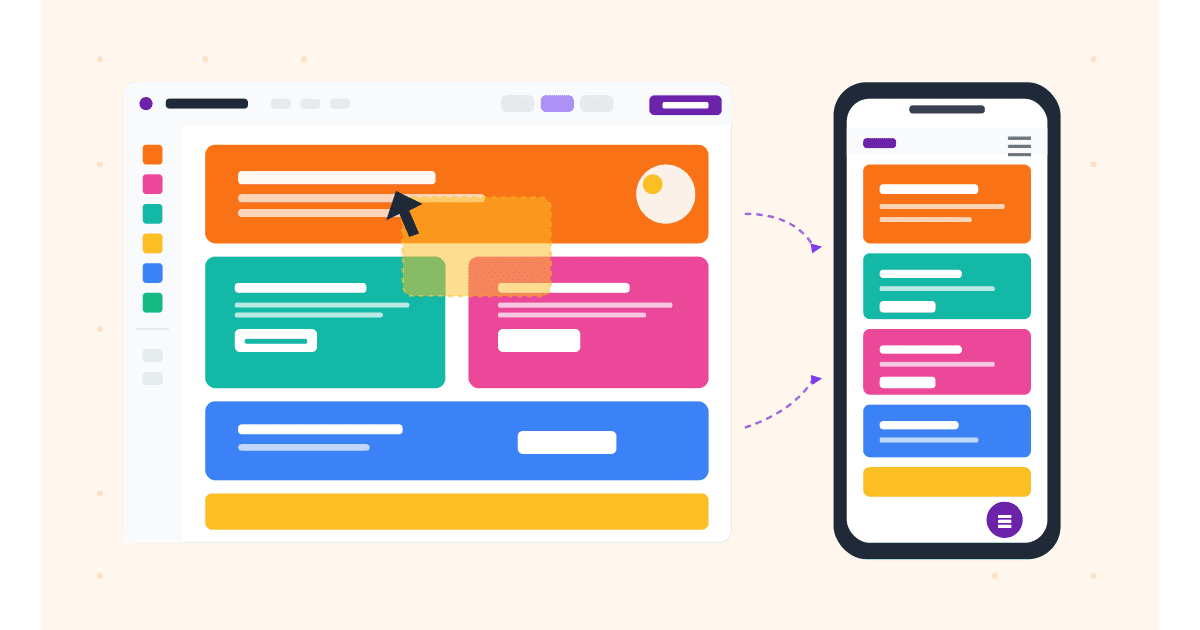
How to switch to mobile view in Wix Editor (the classic product)
The Mobile Editor in classic Wix is one of the most distinctive features of the platform.
Steps:
- Open your site in the Wix Editor.
- At the top-left of the toolbar, you will see desktop and phone icons.
- Click the phone icon.
- The editor switches to a phone-shaped canvas (around 320 px wide).
- Edit. Drag elements, change colors, resize, hide. All changes apply only to the mobile version.
Important rule: edits in Mobile Editor mode do not sync back to desktop. If you make a mobile-specific change, then go back to desktop and change something, the mobile layout will not auto-update. You may need to revisit Mobile Editor to bring it in line.
Common Mobile Editor workflow:
- Finish the desktop design first.
- Switch to Mobile Editor.
- Review the auto-generated mobile layout (Wix's first attempt at adapting your desktop design).
- Reorder, resize, hide, or add mobile-only elements.
- Test in preview mode (the magnifying-glass icon).
- Publish.
The Mobile Editor is best when your mobile design needs to differ from desktop in arrangement, not just size. If your sites stays close to the desktop structure on mobile, Wix Studio's responsive approach is usually a better fit.
Mobile-only elements and the quick-actions bar
Wix is unusual in offering native mobile-only features that have no desktop equivalent.
The Quick Actions bar:
A floating bar at the bottom of the screen with shortcuts (call, WhatsApp, email, scroll-to-top). Visitors can tap to dial, message, or jump back up the page.
To enable:
- In Mobile Editor mode, click the + icon to add an element.
- Choose "Mobile Tools" > "Quick Actions Bar."
- Customize the actions, colors, and which icons appear.
The Back to Top button:
A small floating arrow that appears when the visitor scrolls down. Tap to return to the top.
Mobile-only Welcome Screen:
A splash screen that appears the first time a visitor lands on your site, then disappears. Useful for branding or seasonal promotions. Tap once to dismiss.
These features add real value on mobile and are easy to enable. Be careful not to enable all three at once: a Welcome Screen plus a Quick Actions Bar plus a sticky header eats half the visible screen on a small phone.
Reordering elements on mobile only
The biggest reason teams use Wix Mobile Editor is to reorder elements. The mobile arrangement should often differ from desktop.
Steps in Wix Editor:
- Switch to Mobile Editor mode.
- Click any element to select it.
- Drag to the new position.
- Adjust spacing using the up-down arrows on the right side of the screen.
Common mobile rearrangements:
- Hero text above hero image on mobile (the opposite of a side-by-side desktop layout).
- Logo centered and smaller on mobile, instead of left-aligned and large.
- Testimonial slider replaced with a single stacked testimonial card on mobile.
- Form fields stacked vertically instead of side-by-side.
The Hidden Elements panel:
When you hide an element on mobile in Wix Editor, it moves to the Hidden Elements panel (accessed from the left toolbar). You can re-add it later. The same applies in reverse: elements hidden on desktop appear in the Hidden Elements panel of the desktop view, ready to be restored.
This panel is essential. Without it, you might lose track of what is hidden where, leading to confusing missing-content bugs.
Wix mobile menu: design and behavior
The mobile menu in Wix Editor offers three styles, each customizable.
Available styles:
- Classic dropdown menu: opens below the hamburger icon, shows menu items in a vertical list.
- Slide-in menu: slides in from the left or right side.
- Full-screen menu: covers the entire viewport with the menu items centered.
To switch styles:
- In Mobile Editor, click the hamburger icon (top-right of the header by default).
- Choose "Change Menu Style" from the popover.
- Pick the new style.
Customizations available:
- Background color, opacity, and image.
- Font family, size, and color for menu items.
- Hover and active states.
- Icon style (hamburger, X, dots).
- Animation (fade, slide, instant).
Best practices for Wix mobile menus:
- Use the slide-in or full-screen style for sites with more than 5 menu items. The classic dropdown becomes a long scroll otherwise.
- Match the menu background to your site's color palette.
- Ensure the hamburger icon has at least 44 px tap area.
- Test the menu open/close on a real device. Sometimes Wix animations stutter on older Android phones.
Background customization on mobile
Wix Editor lets you set different backgrounds for mobile and desktop, which is unusual for website builders.
Per-device backgrounds:
- In Mobile Editor mode, click the section background.
- Choose "Mobile Background" from the popover.
- Upload a different image, or set a different color/gradient.
Video backgrounds:
Wix supports MP4 video backgrounds. On mobile, this is rarely a good idea: video backgrounds drain battery, eat data, and slow the page. If you must use a video background on desktop, replace it with a static image on mobile.
Parallax effects:
Parallax backgrounds stutter on mobile Safari due to iOS's scroll-throttling behavior. Wix detects this and falls back to static backgrounds on mobile by default, but verify on a real device to confirm.
For most pages, a solid color or compressed image background is the right choice on mobile. Save the showy backgrounds for desktop, where they actually render smoothly.
Hiding desktop-only elements on mobile
Sometimes a desktop element does not belong on mobile at all.
Steps:
- In Mobile Editor mode, right-click (or long-press) any element.
- Choose "Hide on Mobile."
- The element disappears from mobile view but remains on desktop.
Limitations:
- Some elements cannot be hidden (text elements that are part of a parent group, for example).
- Anchor links to a hidden element will not work on mobile.
- Hidden elements still count toward page weight if they contain images.
Workaround for elements that resist hiding:
Use the Velo platform (Wix's developer extension) to programmatically hide elements based on viewport. This requires JavaScript and is overkill for most use cases. Try restructuring the element into a group first.
SEO consideration:
Hiding content on mobile reduces what Google sees in the mobile-first index. Use this sparingly. The decorative-image case is fine. The "I am hiding half my page on mobile" case is not.
Working in Wix Studio: breakpoints
Wix Studio replaced the separate Mobile Editor with breakpoint-based responsive design.
Default breakpoints:
- Desktop: 1000 px and above.
- Tablet: 750-999 px.
- Mobile: under 750 px.
Custom breakpoints:
In Wix Studio, you can add custom breakpoints between or beyond the defaults. Click the breakpoint icons at the top of the editor, then "Add breakpoint." Useful for sites that need to handle a specific device size (e.g., a kiosk display at 1280 px).
How layouts adapt:
Wix Studio uses stacks, grids, and flex containers. A horizontal stack on desktop reflows into a vertical stack on mobile automatically. You can override per-breakpoint:
- Padding and margin.
- Font size and line height.
- Visibility (show/hide per breakpoint).
- Stack direction (horizontal on desktop, vertical on mobile).
- Grid columns (4 on desktop, 2 on tablet, 1 on mobile).
Editing per breakpoint:
- Click the breakpoint icon you want to edit.
- Change properties (padding, font size, etc.).
- The change applies only to that breakpoint and smaller, unless you set it differently at a smaller breakpoint.
Wix Studio is more powerful than the classic Wix Editor for responsive design but has a steeper learning curve. If you are coming from CSS, breakpoints feel familiar. If you are coming from drag-and-drop, the conceptual switch takes practice.
Mobile-only animations and interactions in Wix
Animations on mobile need extra care. They can either delight users or drain their battery.
Scroll-based animations:
In Wix Editor, click any element and open the Animations panel. Choose from fade, slide, bounce, etc. Wix automatically optimizes these for mobile.
Hover effects on mobile:
Hover does not exist on touch devices. Wix offers a "tap to reveal" behavior that triggers the hover effect on tap. Use sparingly: most visitors expect immediate response, not a hover delay.
Performance trade-off:
Animations that look smooth on desktop can stutter on mid-range Android phones. Test on a real device. If your animation drops below 30 fps on a Pixel 6a, simplify or disable it for mobile.
In 2026, the consensus among Wix designers is "less is more on mobile." A single subtle fade-in beats five competing animations.
Testing your Wix site outside the editor
The Wix Editor preview is iframe-based, like all platform editors. It does not load the live URL with all scripts and CDN behavior. To verify what visitors actually see, you need an external tool.
Workflow:
- Click Publish in the Wix Editor (or use the Site History to create a preview URL).
- Copy the live URL.
- Paste it into MobileViewer.io.
- Pick the devices you care about: iPhone 16 Pro Max, iPhone SE, Galaxy S24, Pixel 8.
- Scroll through each, looking for issues.
What this catches that the Wix editor cannot:
- Page weight issues that only appear on slow 4G.
- Layout shifts during font loading.
- Cookie banners (Wix injects these on the live URL based on visitor location).
- Quick Actions Bar collisions with other floating elements.
- Mobile menu animations on real device hardware.
This is the step most Wix users skip, and it is the difference between sites that look fine in the editor and sites that look fine to real visitors.
Test on 50+ real devices in one click.
Get 200 free tests when you sign up. Compare layouts side-by-side across iPhones, iPads, Pixels, and more.
Start testing on MobileViewer.io →Performance and Core Web Vitals on Wix mobile sites
Wix had a reputation for slow mobile sites for many years. The platform has invested heavily in performance, and in 2026, well-built Wix sites can score 85+ on mobile PageSpeed Insights.
The things you control:
- Image weight. Compress before uploading. Wix's automatic optimization helps, but starting smaller is better.
- Number of fonts. Each font is 50-200 KB. Stick to two.
- Apps installed. Each Wix App (chat, gallery, contact form) adds JavaScript. Audit which apps you actually need.
- Third-party scripts. Custom scripts injected via Embed Code add overhead. Remove what you do not need.
- Video backgrounds. Disable on mobile (covered above).
The things Wix controls (and has improved):
- Server response time.
- CDN delivery.
- Default image optimization.
- HTTP/2 and HTTP/3 support.
A clean Wix site on the Business or Business VIP plan typically loads under 3 seconds on a Slow 4G simulation. The free and Combo plans use slower hosting; expect 4-6 seconds. The hosting tier affects mobile performance significantly.
Custom code and Velo for Wix mobile customization
When Wix's built-in tools cannot do what you need, Wix offers two escape hatches: custom code (Embed Code blocks) and Velo (Wix's JavaScript platform).
Embed Code for HTML and CSS:
You can add an HTML block to any page in classic Wix Editor (Add > Embed > HTML iframe). Use this for custom CSS, third-party widgets, or analytics snippets. On mobile, ensure your embedded HTML uses responsive units (% or rem) instead of fixed pixels.
<style>
  @media (max-width: 480px) {
    .my-custom-element {
      font-size: 14px;
      padding: 8px;
    }
  }
</style>
The embedded HTML lives inside an iframe, which limits how it can interact with the parent Wix page. For most styling needs, this is fine.
Velo for JavaScript-driven mobile behavior:
Velo (formerly Corvid) is Wix's full JavaScript development platform. With Velo enabled, you can write code that runs on your Wix site, including mobile-specific behavior.
Common Velo use cases for mobile:
- Detect viewport size and show different content on mobile.
- Trigger animations only on devices with enough performance.
- Submit forms to custom backends with mobile-friendly UX patterns.
- Build progressive web app (PWA) features.
To enable Velo:
- In the Wix Editor, click the "Dev Mode" toggle at the top.
- The editor expands to show code panels for each page.
- Write JavaScript in the page's
onReadyfunction.
Velo is powerful but adds complexity. Most Wix sites do not need it. If you find yourself wishing for Velo to fix a mobile issue, first check whether the built-in Mobile Editor (classic Wix) or breakpoint controls (Wix Studio) can solve it more simply.
Wix mobile SEO checklist
For mobile-first indexing, Wix sites need the same checks as any other site, plus a few Wix-specific items.
Universal checks:
- Viewport meta tag is set (Wix does this automatically).
- All images have alt text.
- Internal links exist on the mobile version.
- Page titles and meta descriptions are unique.
- Canonical URLs match between mobile and desktop.
Wix-specific:
- The mobile menu links to every important page (audit by opening the menu and verifying every item).
- The mobile version of every page has the same critical content as desktop (no "Read more" buttons that hide half the article on mobile).
- Schema markup is enabled in the Wix SEO Tools (Settings > Marketing > SEO > Advanced).
- Mobile URL structure matches desktop. Wix uses a single URL set, which is the right setup for mobile-first indexing.
Wix mobile QA checklist before publishing
Run this list before every publish:
- Logo size is appropriate (not larger than 50 px tall on mobile).
- Hero section fits within the first viewport without horizontal scroll.
- CTA button is visible above the fold.
- Quick Actions Bar (if enabled) does not cover important content.
- Mobile menu opens and closes smoothly.
- Forms are stacked vertically with correct input types.
- Images have alt text and are compressed.
- Animations do not stutter (test on a real device).
- All apps load without breaking layout.
- Page weight under 2 MB.
- Cookie banner does not cover critical content.
- No horizontal scroll at 320 px viewport width.
Conclusion
Wix is the only major builder where mobile gets its own dedicated editor in the classic product. That power is also the trap: a Wix site can look fine on desktop and broken on mobile, because the two views are independent. The Mobile Editor in classic Wix demands a separate review pass every time desktop changes. Wix Studio's breakpoint system is more efficient for new sites but requires learning a different mental model.
Either way, the workflow that works: edit the mobile view intentionally, preview in the editor, then verify on a live URL with an external tool like MobileViewer.io. That last step catches bugs the editor cannot show, and it is the difference between a Wix site that looks good in the editor and one that works for visitors.
Frequently asked questions
How do I switch to mobile view on Wix?
In classic Wix Editor, click the phone icon at the top-left of the editor toolbar. In Wix Studio, click the mobile breakpoint icon at the top of the editor (the smallest of the device-size icons in the row).
Can I have a different layout on mobile in Wix?
Yes. In classic Wix Editor, the Mobile Editor mode gives you a completely independent layout for mobile. In Wix Studio, you can adjust padding, font size, stack direction, grid columns, and visibility per breakpoint.
Does Wix Studio have a mobile editor?
Wix Studio does not have a separate Mobile Editor like classic Wix. Instead, it uses breakpoints. You edit a single layout that adapts to desktop, tablet, and mobile via stacks, grids, and per-breakpoint overrides.
How do I hide elements on mobile in Wix?
In classic Wix Editor, right-click the element and choose "Hide on Mobile." In Wix Studio, click the element, then toggle visibility off in the mobile breakpoint.
Is Wix mobile-friendly out of the box?
Mostly. Wix auto-generates a mobile layout from your desktop design, but the result is rarely the design you would choose if you were starting from mobile. Plan to spend 15-30 minutes per page refining the mobile-specific layout in either Mobile Editor or via Wix Studio breakpoint overrides.
How do I add a mobile menu in Wix?
The mobile menu is enabled by default. To customize, switch to Mobile Editor mode, click the hamburger icon in the header, and choose "Change Menu Style." You can pick from classic dropdown, slide-in, or full-screen styles.
Why is my Wix site slow on mobile?
Common causes: heavy images, too many fonts, too many installed apps, video backgrounds on mobile, or a lower-tier hosting plan. Run your live URL through PageSpeed Insights to identify the specific bottleneck. Compress images, remove unused apps, and consider upgrading to the Business plan for better hosting if performance matters.
Building on multiple platforms? See our guides to mobile view in WordPress and Squarespace mobile view. Or verify any site on real device frames free.